Product redesign · Muaban Retail — the grocery point-of-sale from my first company
Project
Stock You Can Trust: Redesigning a Grocery POS
platform
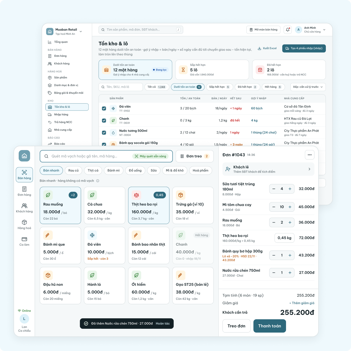
Tablet POS for the cashier (landscape, 1280×800) and one web back-office (1440×900) for the owner, manager and stockkeeper of a neighbourhood grocery store. The web replaces two old admin apps.
Responsibilities
Evaluate the old cashier and admin apps with a heuristic evaluation (Nielsen’s 10 heuristics) and a cognitive walkthrough, model how stock moves through the store, then redesign selling, products, goods in, stock alerts, expiry, supplier returns and staff permissions.
Feature
Scan-first selling with automatic first-expired lots and three ways to pay, products added from their barcode, goods receipts with lots and expiry, reorder suggestions, per-lot markdowns, supplier returns with a debt ledger, and role-based permissions.
Overview
The old app treated stock as a number in a form: the customer picked the lot, safety stock warned nobody and expired goods stayed on the shelf. I rebuilt it around one rule — stock only changes through a document — so every number on screen traces back to a person, a time and a lot.
1. Case Study Overview
a. Context & Evaluation
Three roles: cashier, owner, stockkeeper
Heuristic evaluation: 3 old apps, 17 issues
Cognitive walkthrough: selling and reordering
Three principles for the redesign
c. Redesign by Area
Selling at the counter: scan, lots, pay
Products: start from the barcode
Stock: goods in, running low, expiry
Supplier returns, debt and staff
b. How the System Works
Products set rules, documents move stock
One product’s life, from creation to restock
Alerts and one 07:00 digest
Roles and permissions
d. Review & Edge Cases
Before → after on five key moments
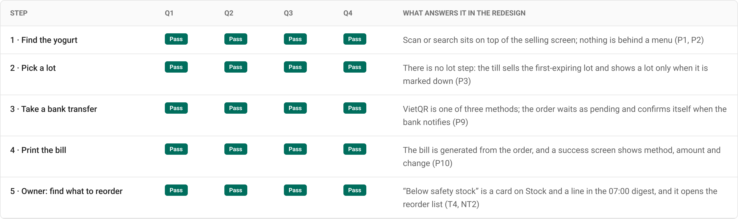
The same walkthrough on the new screens
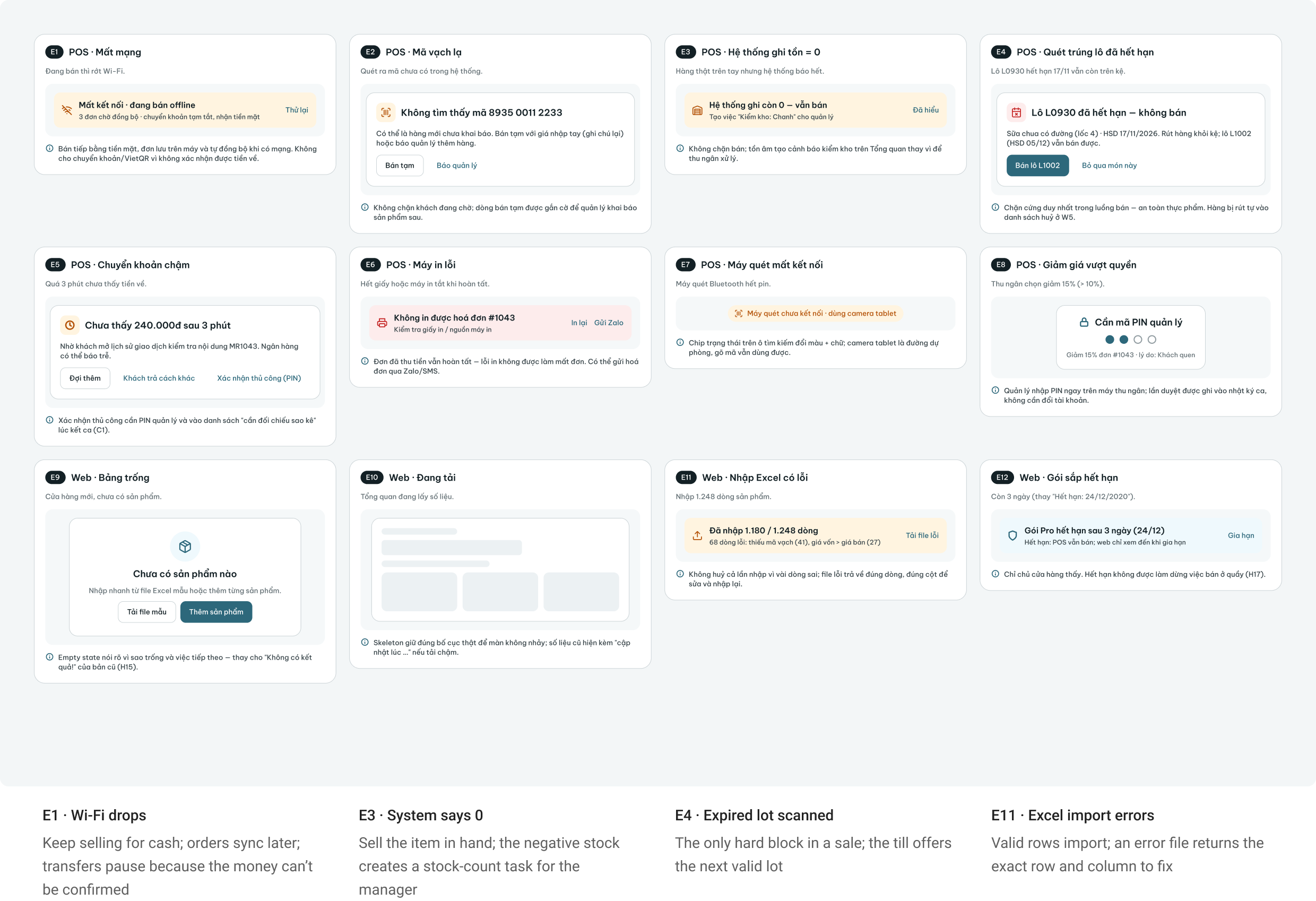
Edge cases and system states
2. Context & Problem
Muaban Retail is the grocery edition of the POS from my first company: a cashier tablet at the counter and two admin apps for the owner. It shipped on a template built for fashion shops. In 2026 I redesigned it as one system: a tablet at the counter and one web back-office.
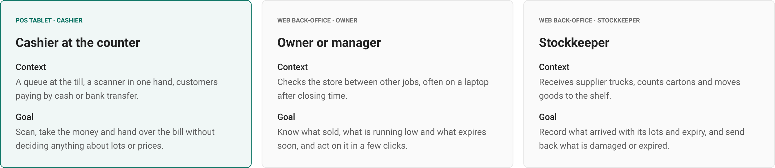
Who uses it: three roles, two surfaces
The cashier works at the counter on a tablet; the owner and the stockkeeper work in the web back-office. All three read the same products, lots and documents.
Heuristic evaluation of the old apps
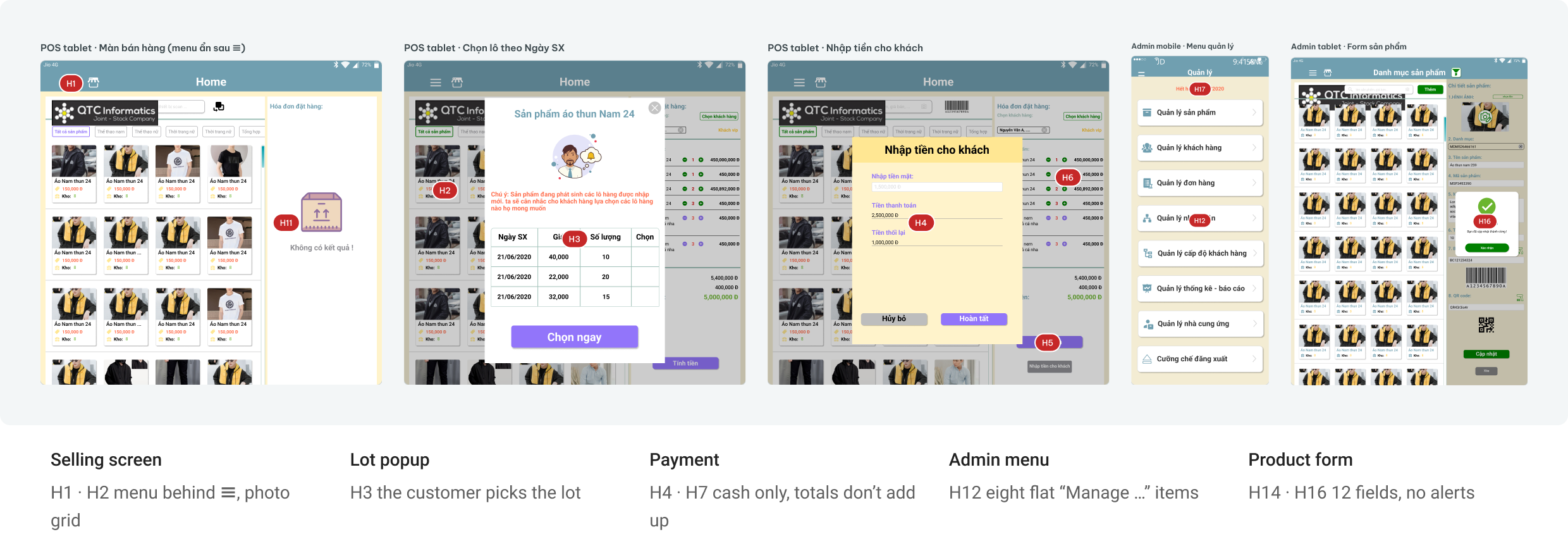
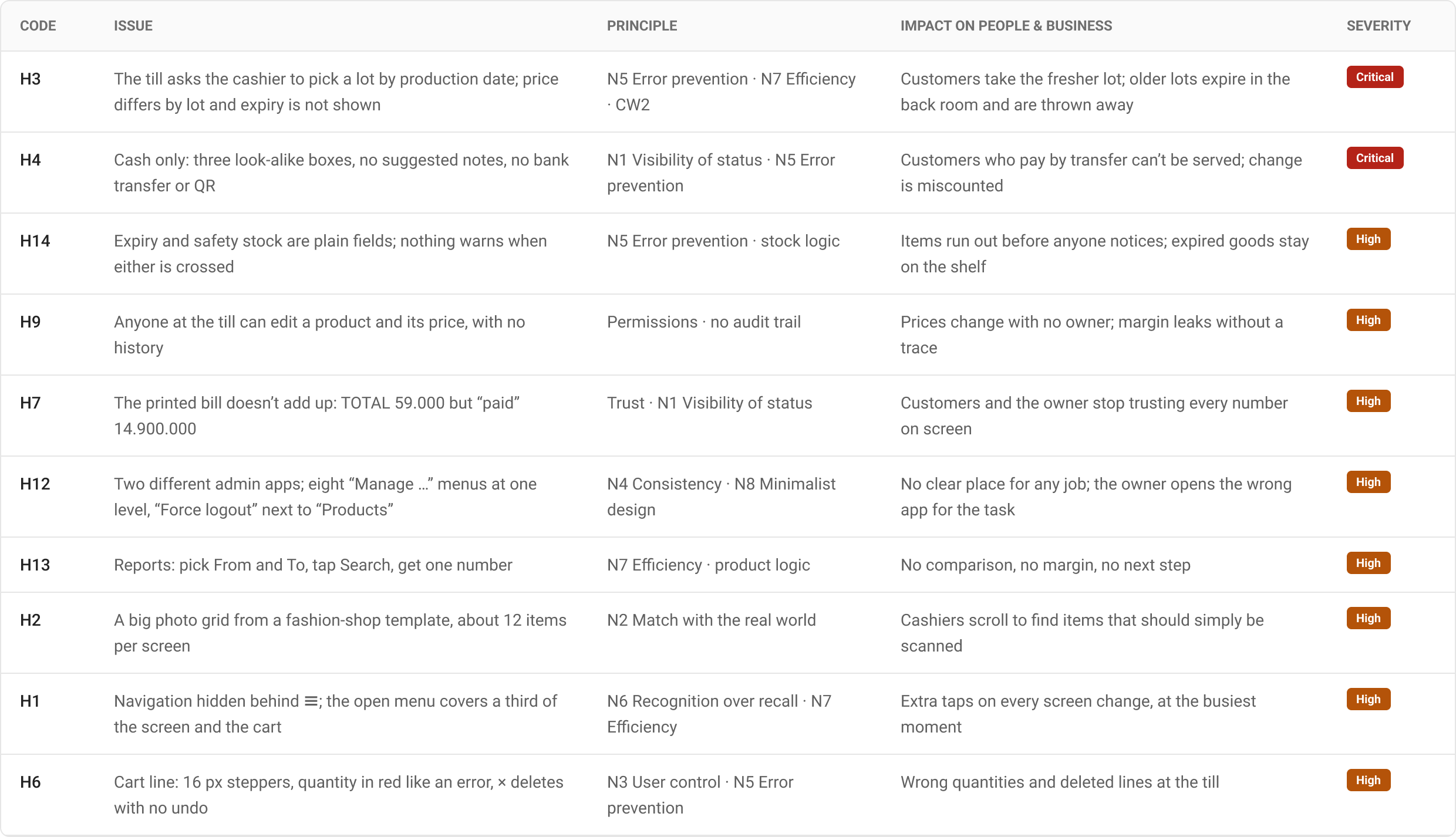
I audited the cashier tablet, the admin tablet and the admin phone app against Nielsen’s heuristics: 17 issues, 2 Critical and 8 High. The worst ones sit exactly where stock and money change hands.
Plus 7 Medium and Low issues: four colours competing for the main action (H5), filters that need exact dates and codes (H8), a success popup after every save (H10), low contrast on beige (H11), a misleading “No results!” (H15), a 12-field numbered product form (H16) and an expiry date with no action (H17).
Cognitive walkthrough of two core tasks
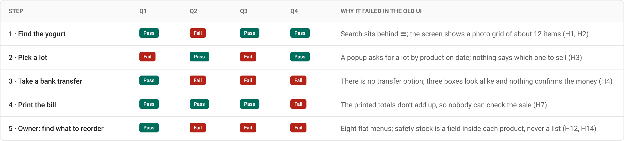
Task A: a first-week cashier sells yogurt from a product with two lots, and the customer pays by bank transfer. Task B: the owner finds what to reorder before Tuesday’s delivery. Q1 knows what to do · Q2 sees the action · Q3 understands it leads to the goal · Q4 knows what just happened.
10 of 20 checks failed, mostly on Q2 (seeing the action) and Q3 (understanding where it leads). Each failure maps to a fix in sections 4–6.
Three principles for the redesign
3. How the System Works
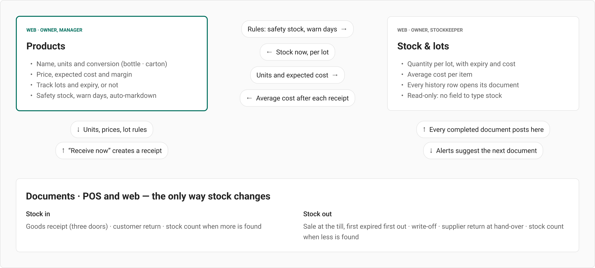
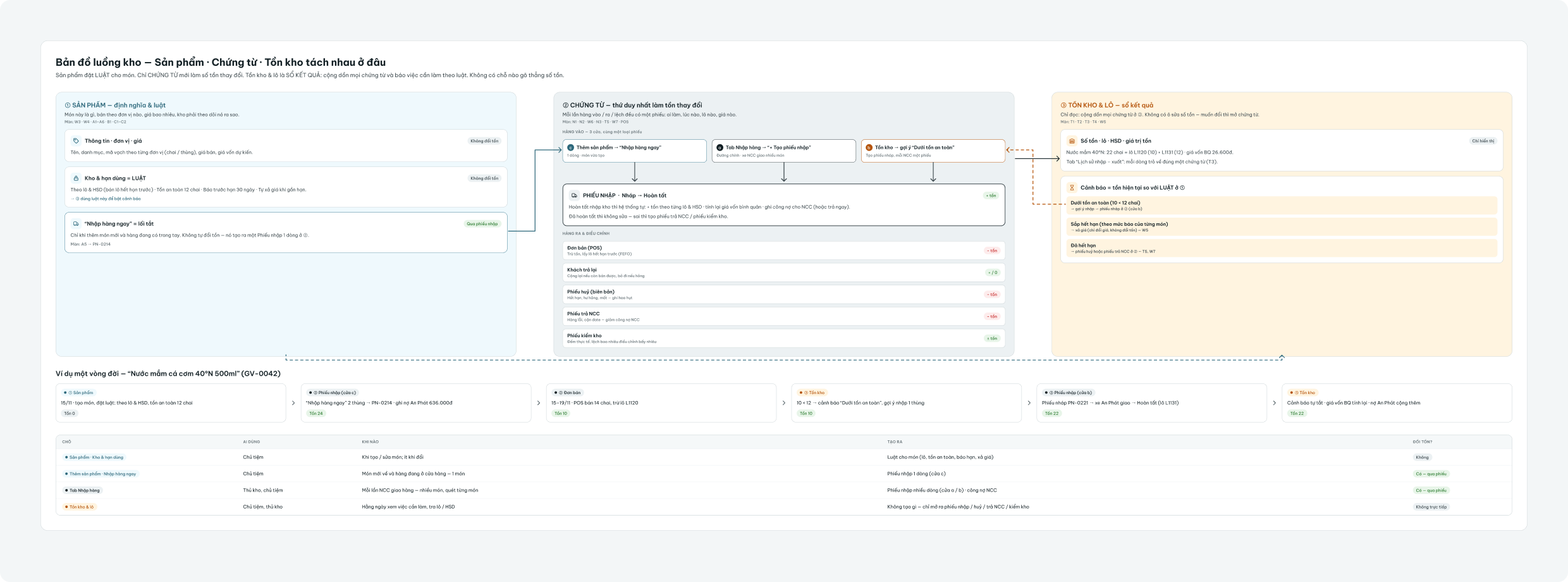
Before redrawing any screen I wrote down how stock moves through the store: what sets the rules, what changes the numbers and who needs to know. The stakeholder’s key question — “what makes Products, Goods in and Stock different?” — is answered by this one model.
Three parts, one rule
Products set the rules, documents move stock, and the stock page adds the documents up and checks them against the rules.
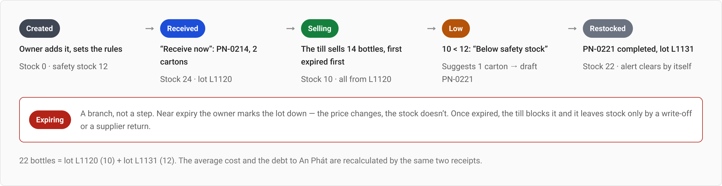
One product’s life, from creation to restock
Five steps and one branch, followed on one product: fish sauce 40°N 500 ml (GV-0042). Every number in the strip is a document someone can open.
What the system watches, and one message a morning
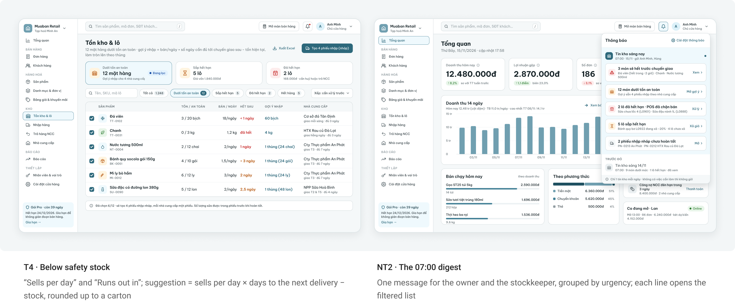
Three rules run after every document. Instead of one notification per item, the owner and the stockkeeper get one digest at 07:00 — “9 items below safety stock · 1 lot expired” — and each line opens the filtered list. Nothing to do, no message.
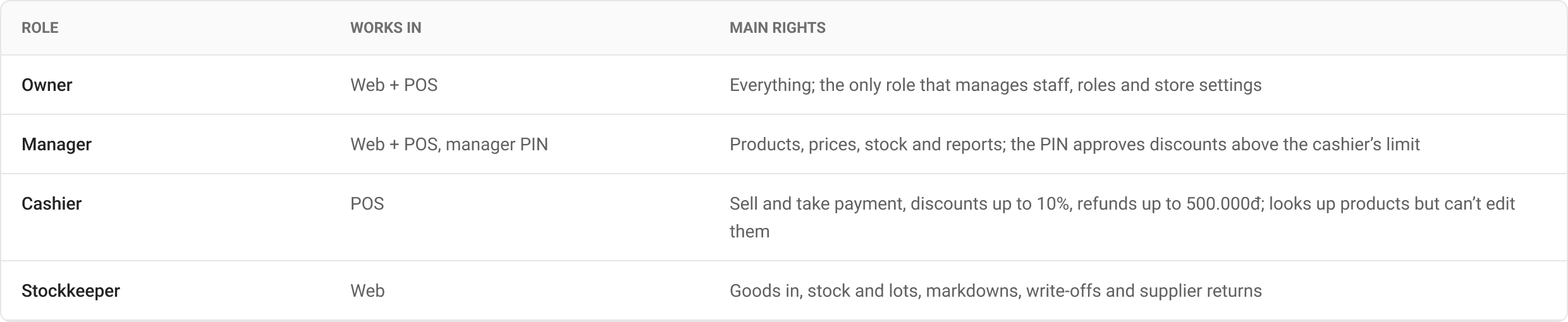
Roles and permissions
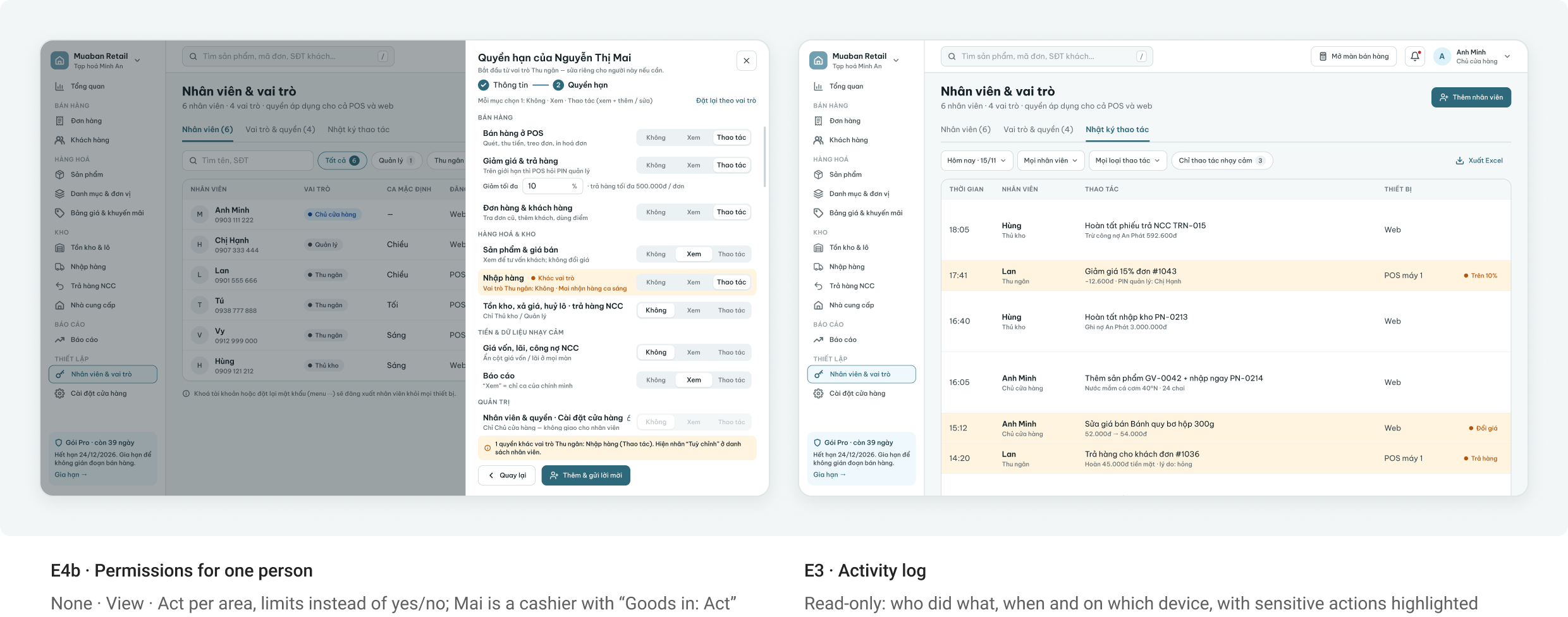
Each role sets a default, and the owner can change single areas for one person: None · View · Act. The old “Force logout” button became “Lock account”, which signs the person out of every device.
The stock flow map in the working file
How Products, Documents and Stock split the work, with one product followed from creation to restock — drawn in the working file next to the real screens.
4. Selling at the counter (POS tablet)
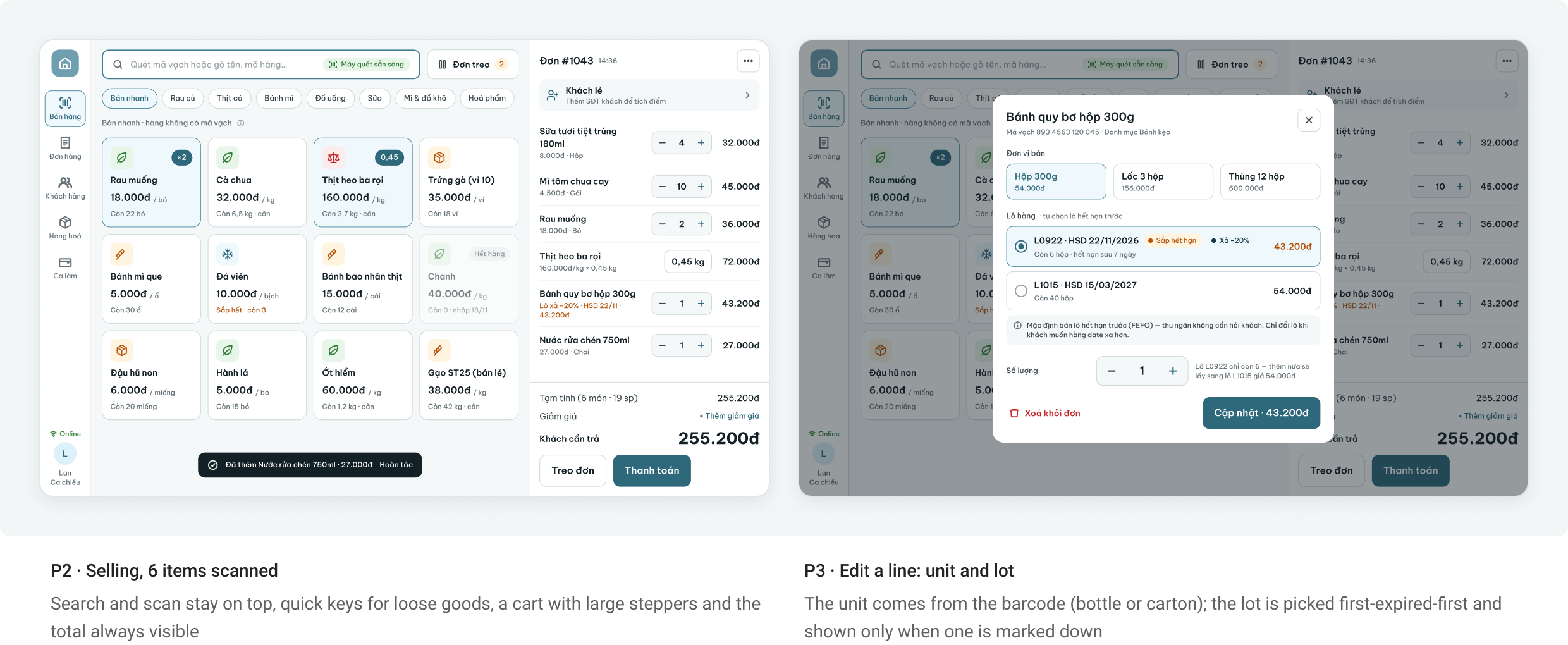
Built for a queue. The cashier scans, takes the money and hands over the bill; lots, units and limits run underneath. 18 POS screens in the working file; the key ones are below.
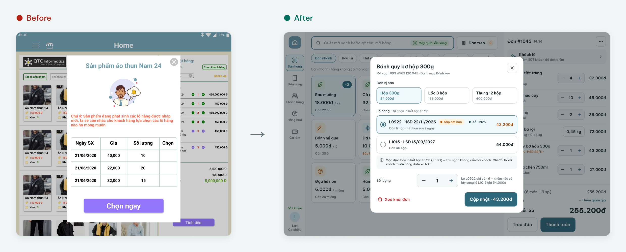
Scan, and the lot picks itself
Scanning is the main input; the photo grid shrinks to quick keys for items without a barcode. The till sells the lot that expires first, so the cashier never asks the customer which lot they want.
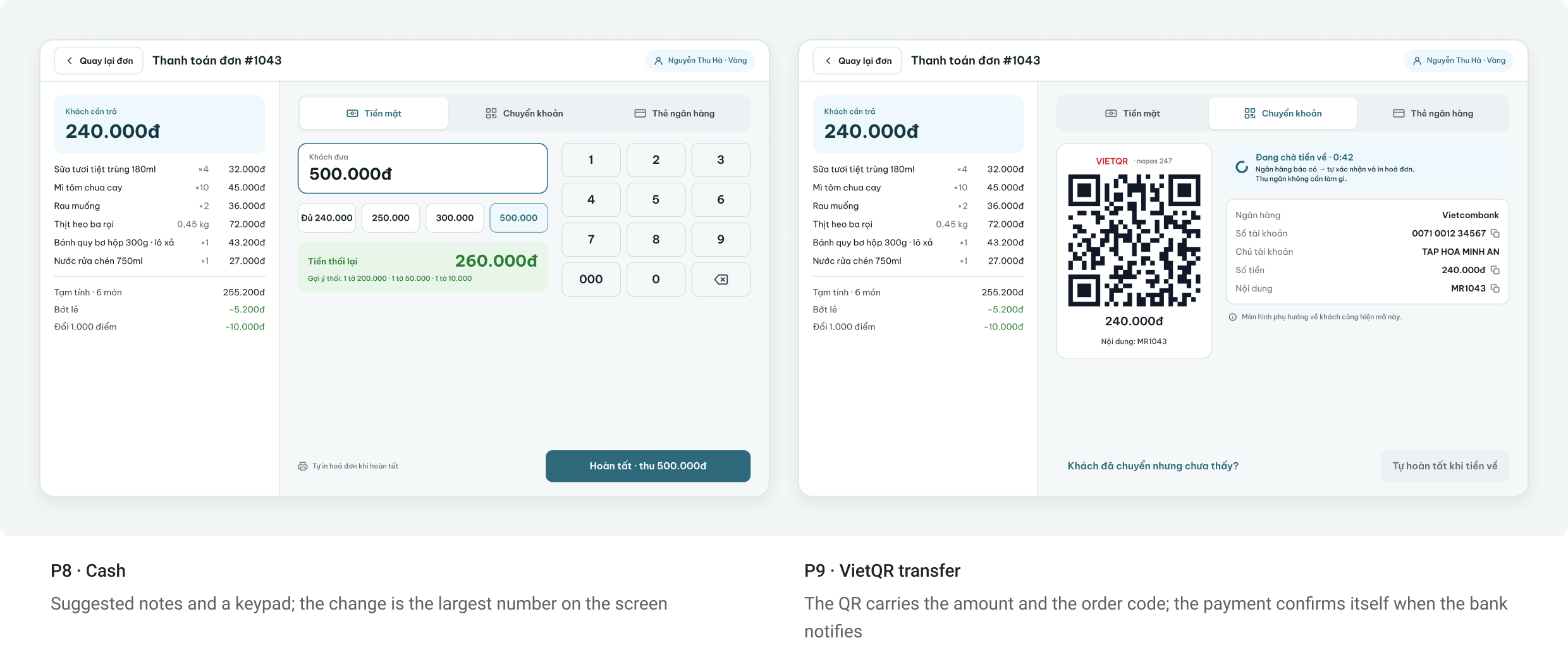
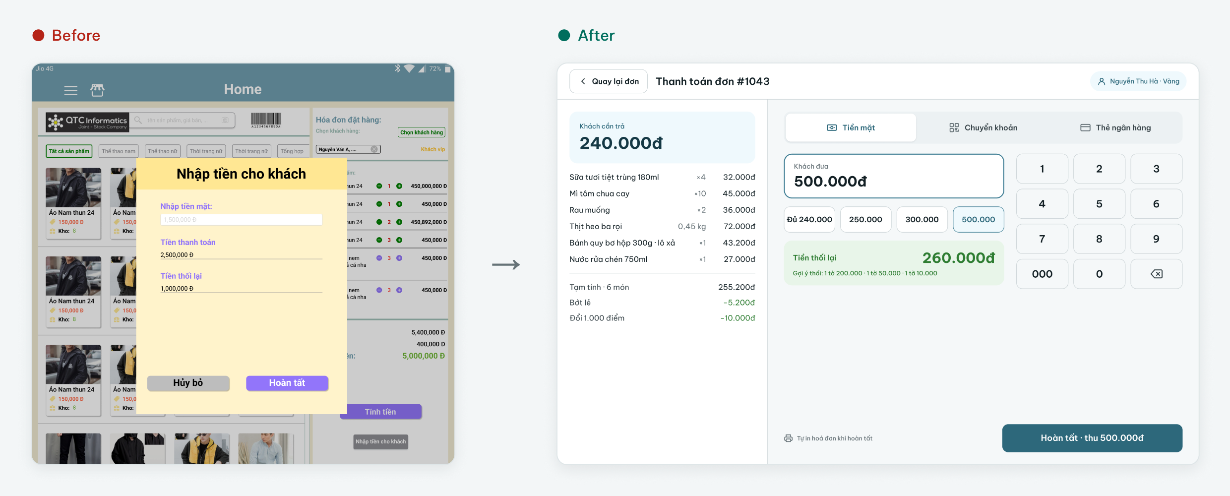
Get paid three ways
The old till took cash only, in three look-alike boxes. Now the cashier picks the method the customer actually uses, and every method ends on the same success screen.
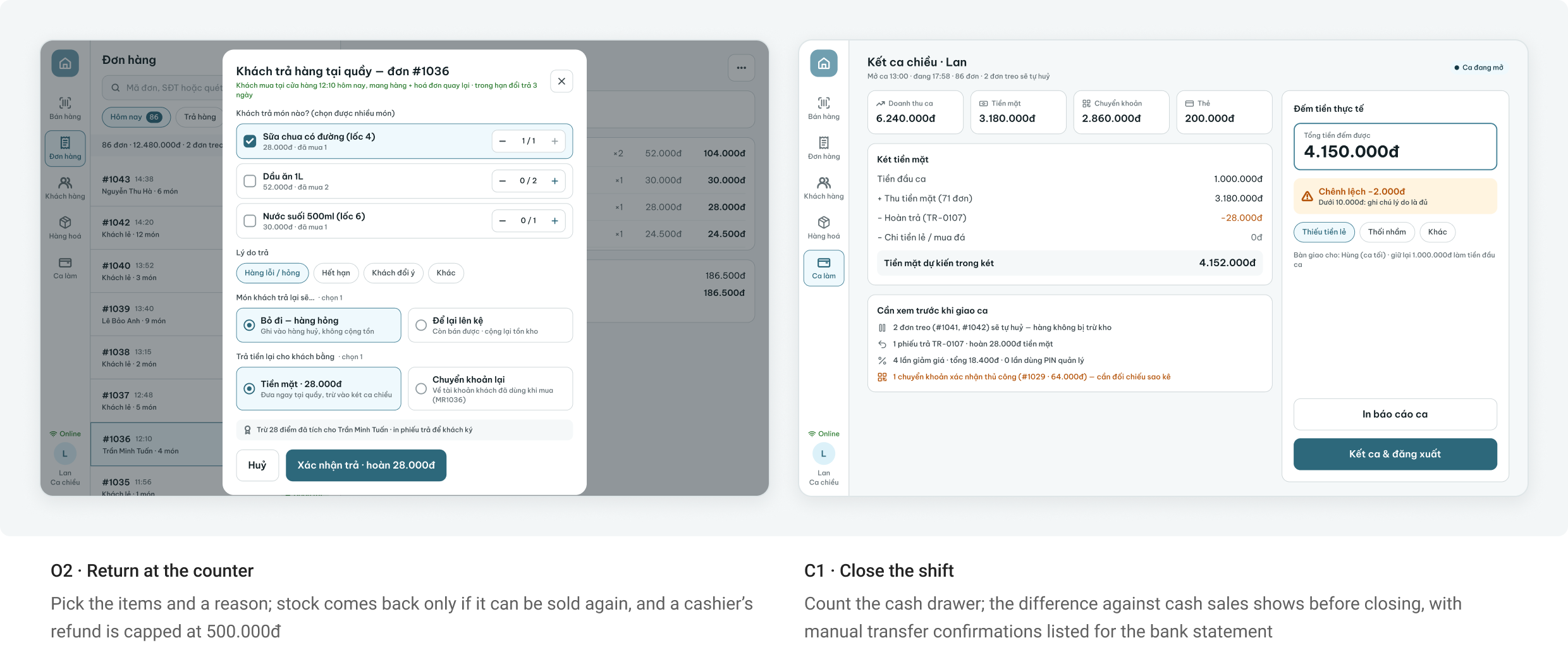
Returns and the end of the shift
A return starts from the receipt the customer brings back, and the shift ends by counting the cash drawer against what the till recorded.
5. Products (web back-office)
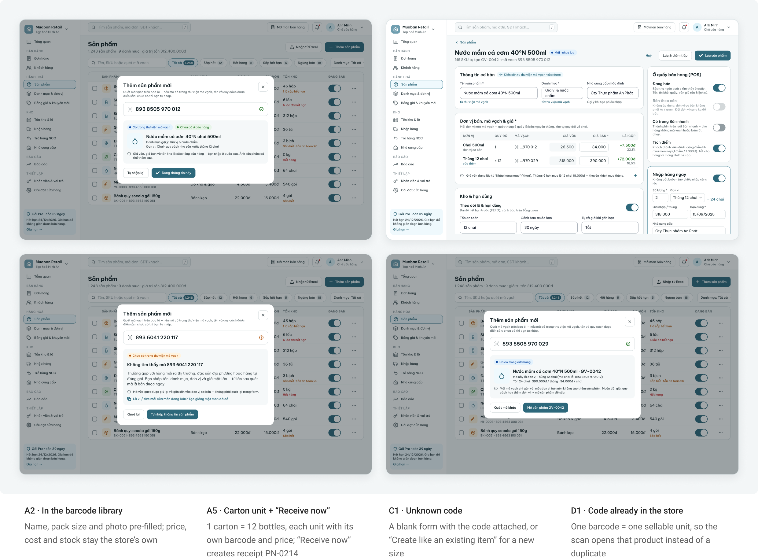
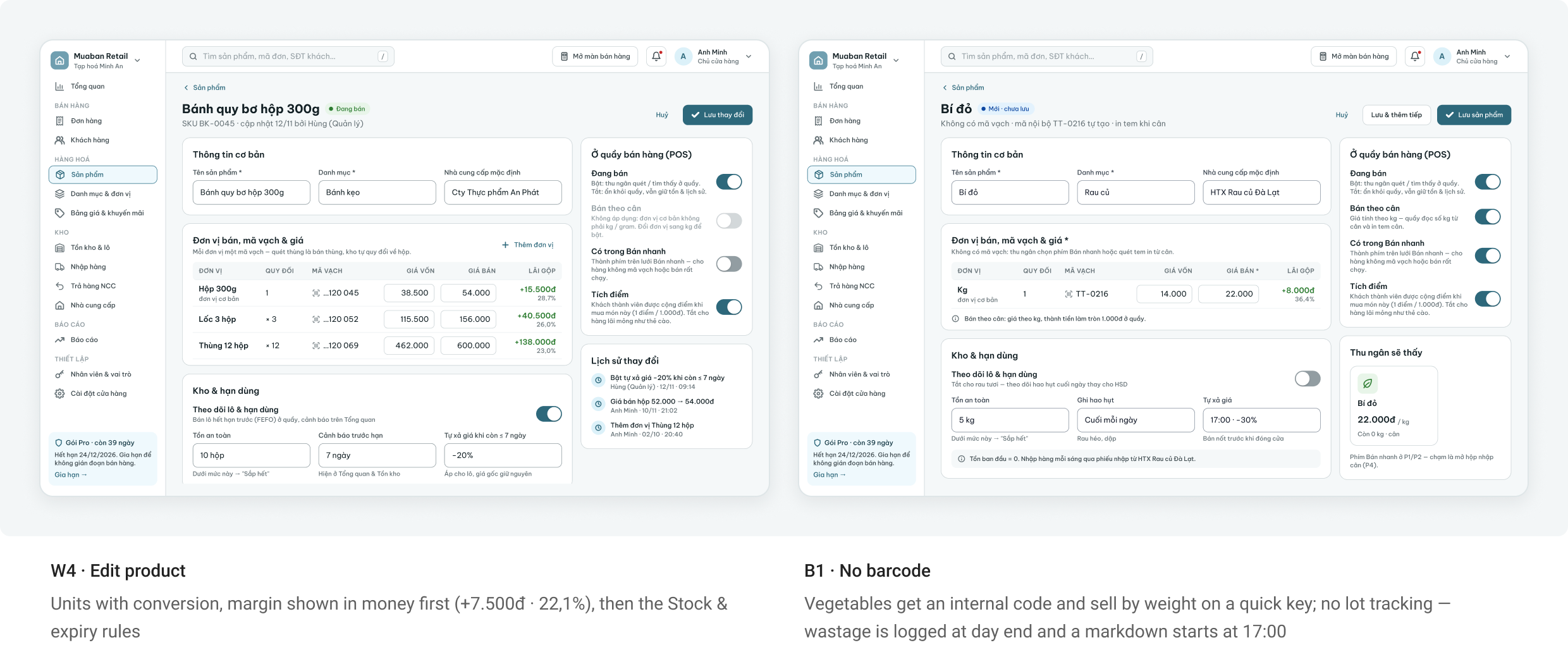
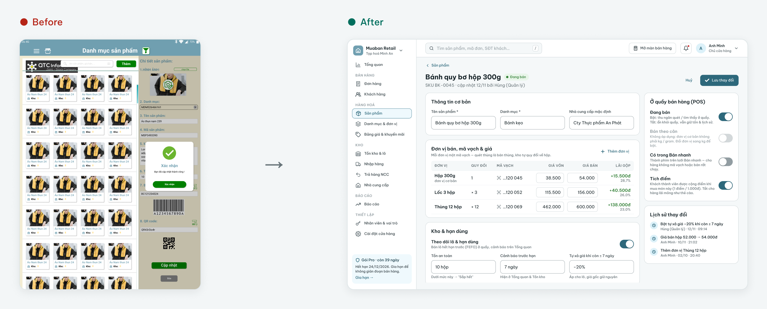
Adding a product starts from one scan field, and the form holds rules, not stock. 18 screens in the working file cover adding, units, categories and items without a barcode.
Add a product from its barcode
The system branches on what the scan finds. The owner never fills 12 fields from scratch (H16), and stock on day one comes from a real receipt, not a typed number.
Rules that travel with the product
Units carry the conversion per product, categories hold the defaults for new items, and loose goods follow a lighter rule. The units page only stores a name and how it is counted.
6. Stock, suppliers and staff (web back-office)
Where the logic of section 3 becomes screens: goods coming in, items running low, lots expiring, goods going back to suppliers, and who may touch any of it. 38 screens in the working file.
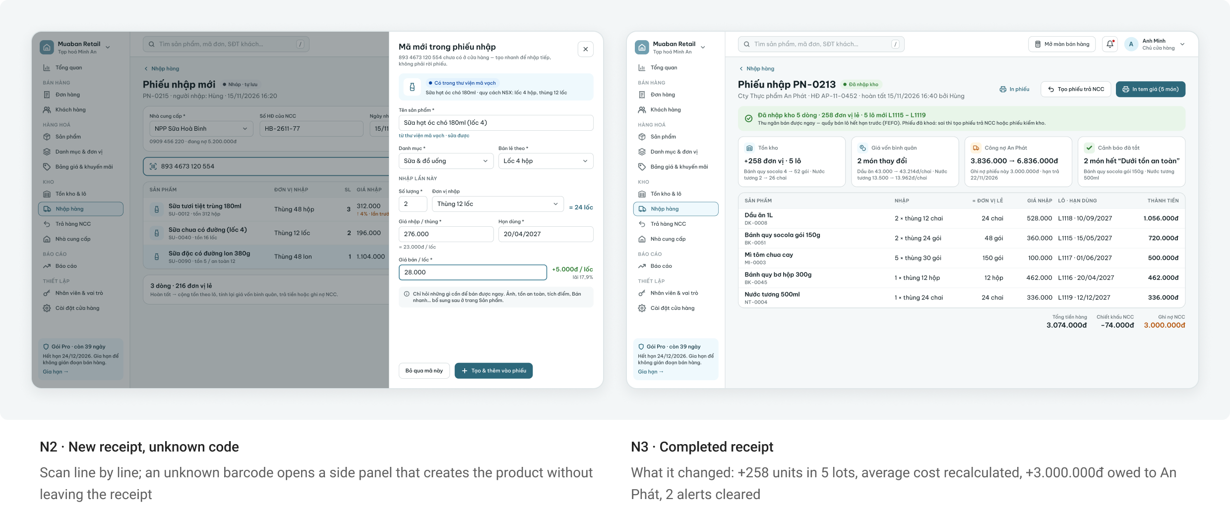
Goods in: three doors, one receipt
Every unit enters through the same document. A truck delivery, a reorder suggestion and “Receive now” on a new product all create a goods receipt that moves from Draft to Completed.
Running low: from a number to an order
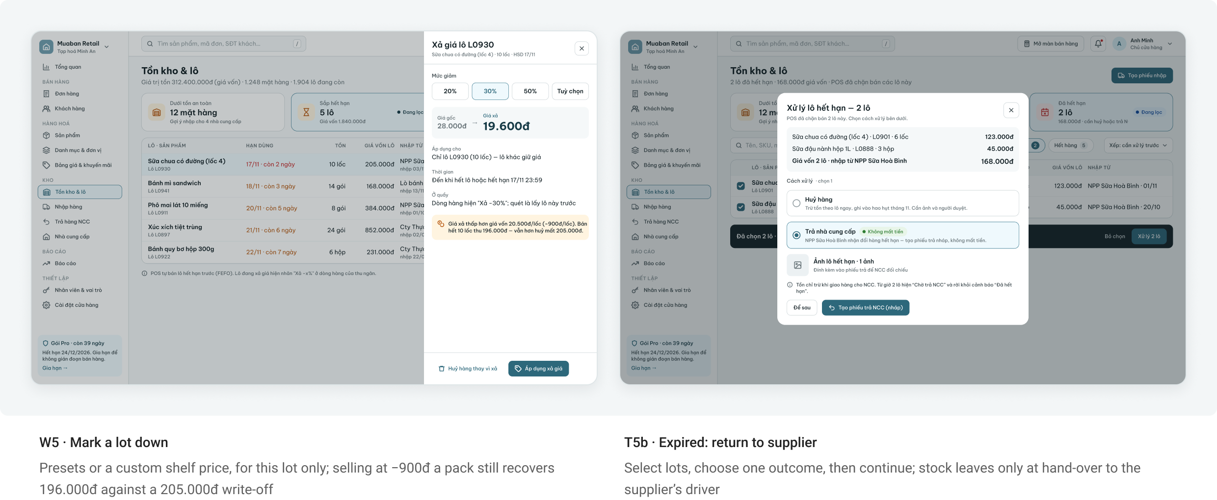
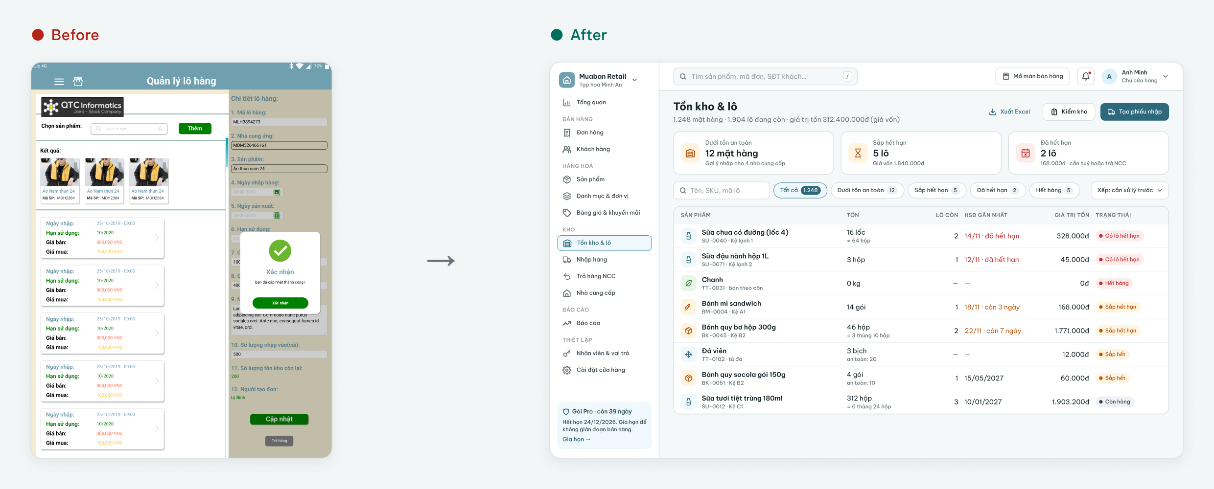
Safety stock is now a rule checked after every document. The list says how urgent each item is and how much to order to cover the gap until the supplier’s next truck.
Near expiry and expired
Near expiry only the price changes. Once a lot has expired, only a document can take it out of stock.
Supplier returns and the debt ledger
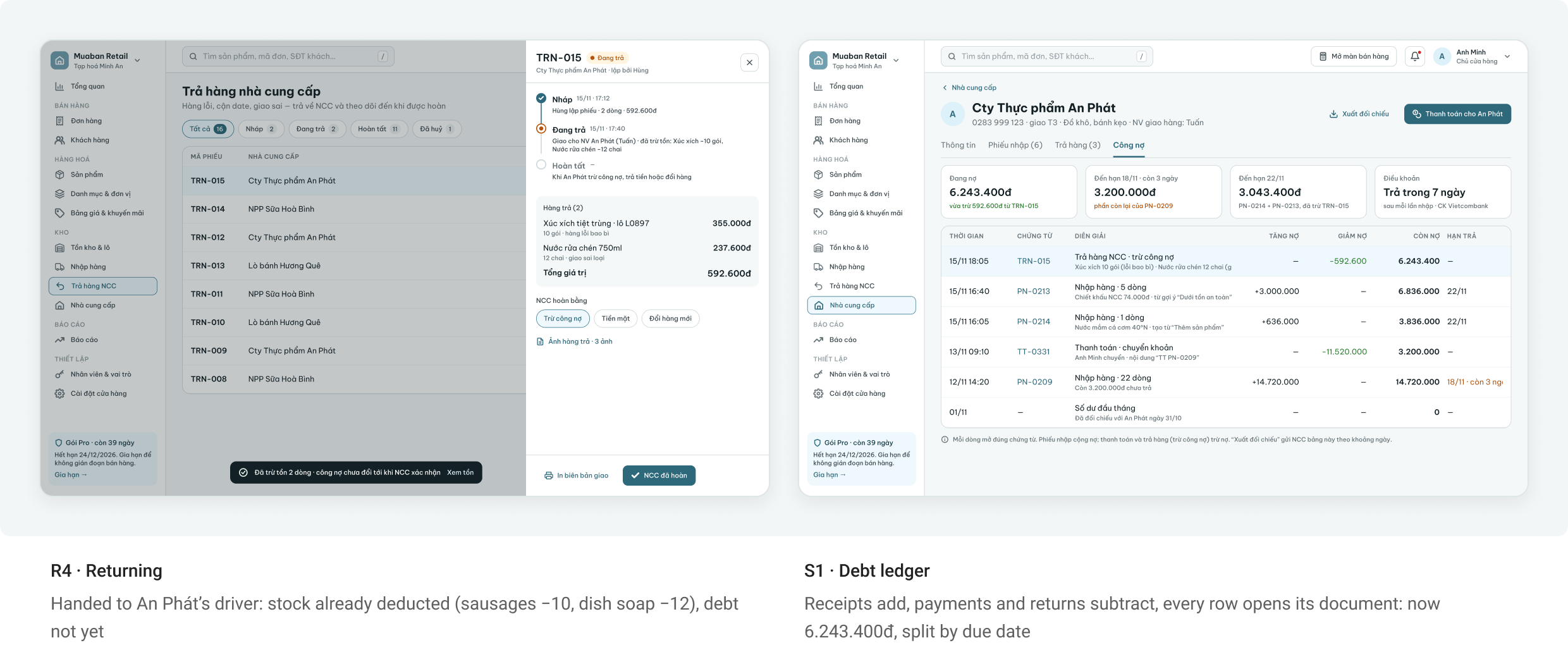
A supplier return mirrors a receipt: Draft → Returning → Completed. Stock leaves at hand-over; the debt drops only when the supplier settles.
Who can do what
Roles set a default, one person can differ, and every sensitive action leaves a trace.
7. Before → After
Five moments where the old UI failed most, next to the redesign. Each pair names the audit issue it fixes.
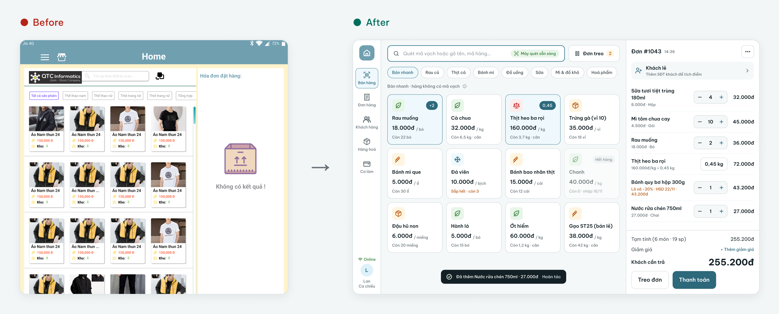
Selling screen
H1 · H2: menu behind ☰ and a photo grid → a fixed rail, scan first, quick keys only for loose goods
Choosing a lot
H3: the customer picked a lot by production date → first expired, first out; a lot shows only when it is marked down
Payment
H4 · H7: cash only in three look-alike boxes → cash, VietQR and card, with a bill generated from the order
Lots and expiry
H14: lots managed one product at a time → stock and lots sorted by expiry, with alert cards that open the next step
Product form
H16: 12 numbered fields → a grouped form with units, conversion, stock rules and a change history
The same walkthrough on the new screens
I repeated both tasks from section 2 on the redesigned screens: the same first-week cashier, the same owner, the same four questions. This is my own inspection, not a test with users.
Old UI: 10 of 20 checks passed. Redesign: 20 of 20 in my walkthrough. It still needs to be confirmed with real cashiers and owners before shipping.
8. Edge Cases & System States
A store till runs on shaky Wi-Fi, Bluetooth scanners and paper rolls, and the back-office runs on Excel imports. I designed the unhappy paths before polishing the happy one.
9. Lesson learned
1. Draw the logic before the screens
The stakeholder’s best question was “what makes Products, Goods in and Stock different?”. One map — rules, documents, ledger — answered it, and every later screen had to fit it.
2. Give each number one way to change
Once stock moved only through documents, whole features disappeared: no stock field, no fix button. I also followed one product and one supplier across every screen until dates, debts and counts agreed.
3. Alerts are a budget, and so are options
Twenty item alerts a morning teach people to ignore all of them; one 07:00 digest was the version the stakeholder chose. A third unit type I couldn’t justify was cut the same way.