Product redesign · Muaban POS — the F&B point-of-sale from my first company
Project
One Order, Three Apps: Redesigning an F&B POS
platform
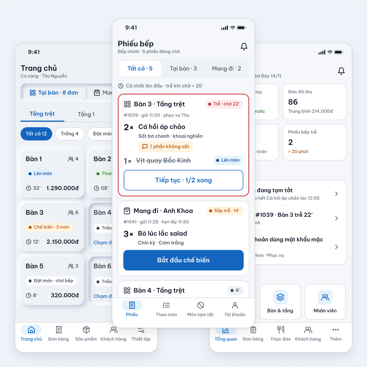
Mobile-only POS for small and mid-size F&B shops (iOS & Android phones). Three apps around one order: a service app (owner, server, cashier), a kitchen app and an admin app (owner, manager).
Responsibilities
Evaluate the shipped 2020 UI with a heuristic evaluation (Nielsen’s 10 heuristics + WCAG 2.2) and a cognitive walkthrough of the core task, map how one order moves between the three apps, then redesign every flagged issue across ordering, payment, kitchen, menu, staff and reports.
Feature
Ordering by dining table with clear options, send to kitchen with live dish status, three ways to pay with a printed VietQR bill, kitchen tickets with waiting time and sold-out alerts, and an admin that runs menu, staff and reports from a phone.
Overview
The 2020 product worked, but each app was designed on its own. Dining-table status was colour only, paying was one “Print & pay” button, the kitchen hid actions behind swipes and servers never knew a dish was sold out, and every admin module opened with an intro screen. I rebuilt it as one system around a single order lifecycle that all three roles read the same way.
1. Case Study Overview
a. Context & Evaluation
Three roles, three apps, one order
Heuristic evaluation: 14 screens, 18 issues
Cognitive walkthrough: 7 of 16 checks failed
Three principles for the redesign
c. Redesign by App
Service app: order → kitchen → pay
Kitchen app: tickets, late and sold-out
Admin: overview, menu, orders, staff, reports
Same states and words in all three apps
b. How the System Works
One order lifecycle shared by all apps
Data flow: service → kitchen → service → admin
Notification priorities P1 · P2 · P3
Roles and permissions
d. Review & Edge Cases
Before → after on five key moments
The same walkthrough on the new screens
Edge cases and system states
2. Context & Problem
Muaban POS is the product of my first company: a mobile POS for small restaurants and cafés, where the owner often takes orders, runs the cashier and checks the business from the same phone. The 2020 version shipped fast and did its job. In 2026 I went back to redesign it properly, as one system instead of three separate apps.
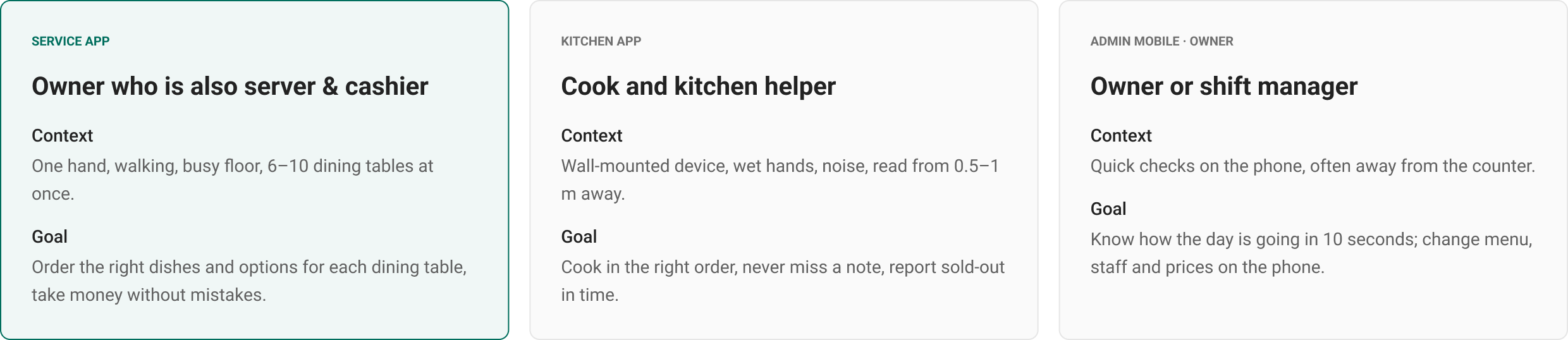
Who uses it: three roles, three apps
Each role works in a different place with a different device, so each app has its own job, but all of them read and change the same order.
Heuristic evaluation of the shipped UI (2020)
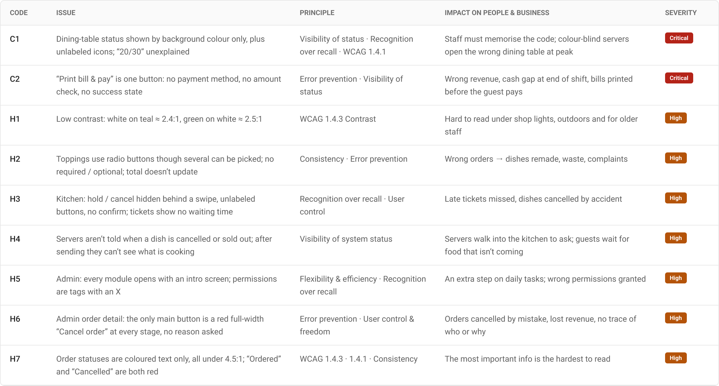
I audited 14 screens from the three apps against Nielsen’s heuristics and WCAG 2.2: 18 issues, 2 Critical and 7 High. The worst ones sit exactly where money and food change hands.
Plus 9 Medium and Low issues: placeholder-only labels, repeated “Choose” buttons, 7+ colours without meaning, illustrations taking 30–40% of the screen, red as the admin’s primary colour.
Cognitive walkthrough of the core task
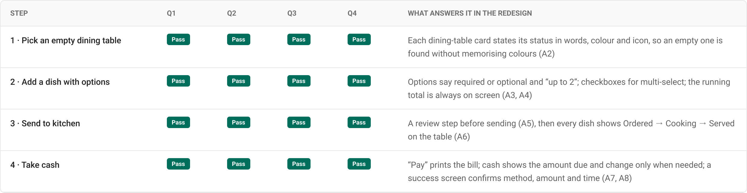
Task: open an empty dining table, order 4 dishes (one with options), send to kitchen, take cash. User: a server in their first week. Q1 knows what to do · Q2 sees the action · Q3 understands it leads to the goal · Q4 knows what just happened.
7 of 16 checks failed, mostly on Q3 (understanding the action) and Q4 (feedback after it). Each failure maps to a fix in section 4.
Three principles for the redesign
3. How the System Works
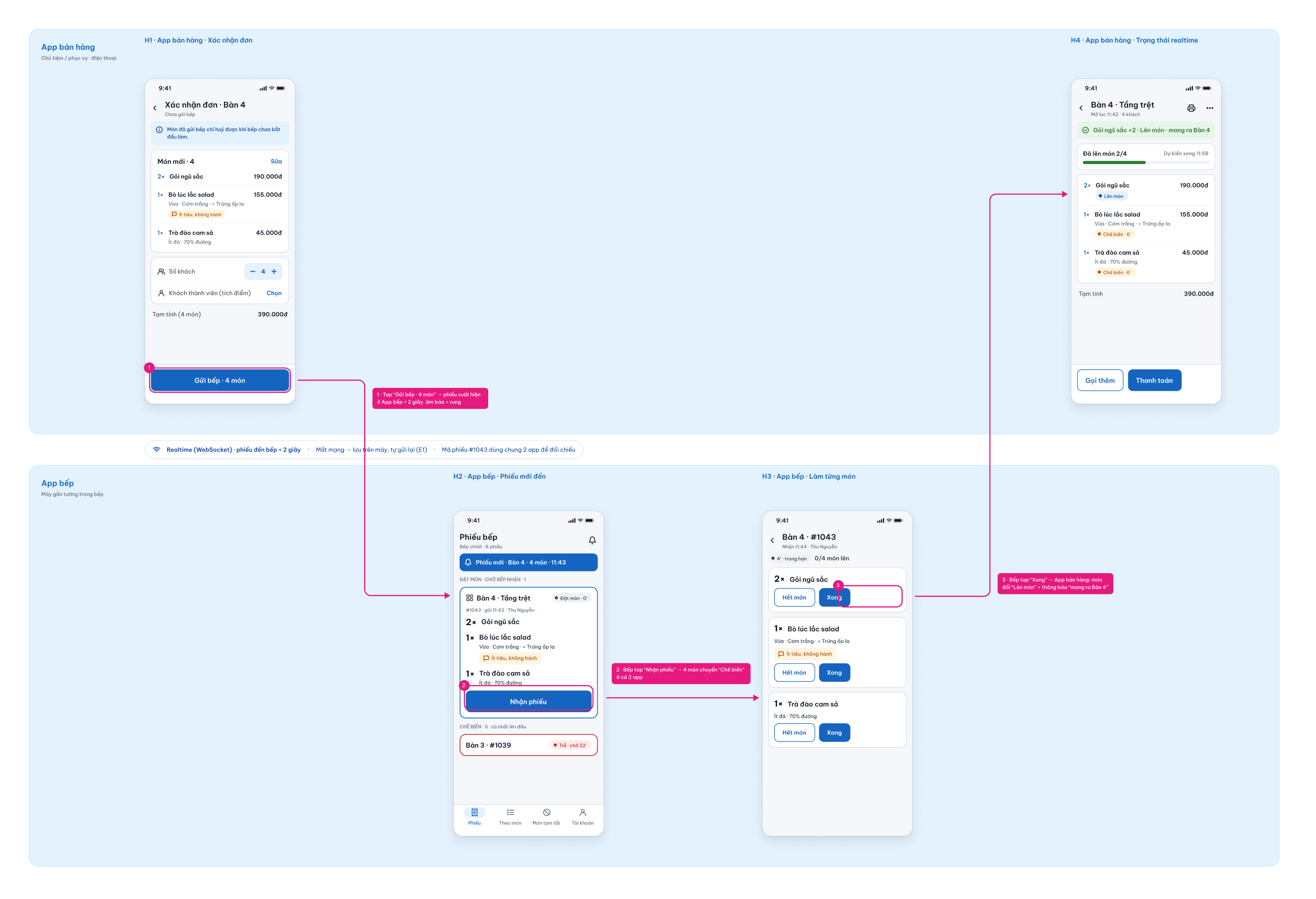
Before redrawing any screen I wrote down how one order travels through the system: who creates it, who changes it and who needs to know. Every screen in every app reads from this one model, which is what makes three apps feel like one product.
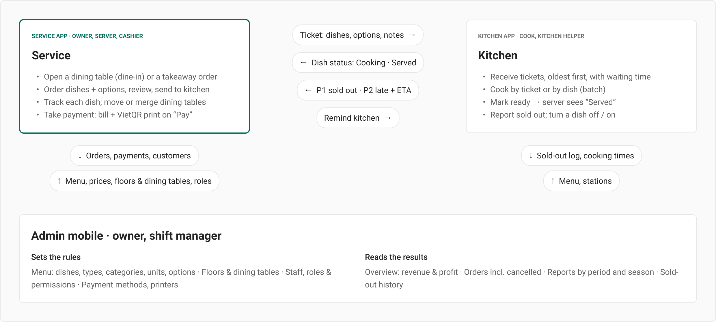
Three apps, one order
The service app creates and closes the order, the kitchen moves its dishes, and the admin sets the rules (menu, prices, roles) and reads the results.
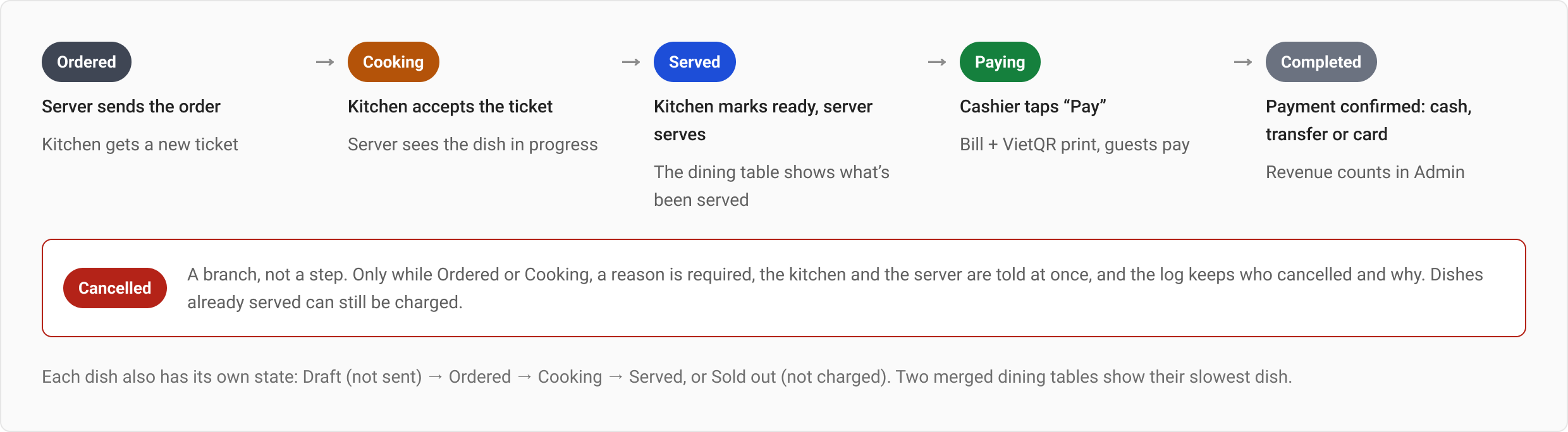
One order lifecycle, read the same way everywhere
Five steps and one branch. The same words, colours and icons appear on the dining-table card, the kitchen ticket and the admin order list. In the old app the same order showed six different colours, and “Ordered” and “Cancelled” were both red.
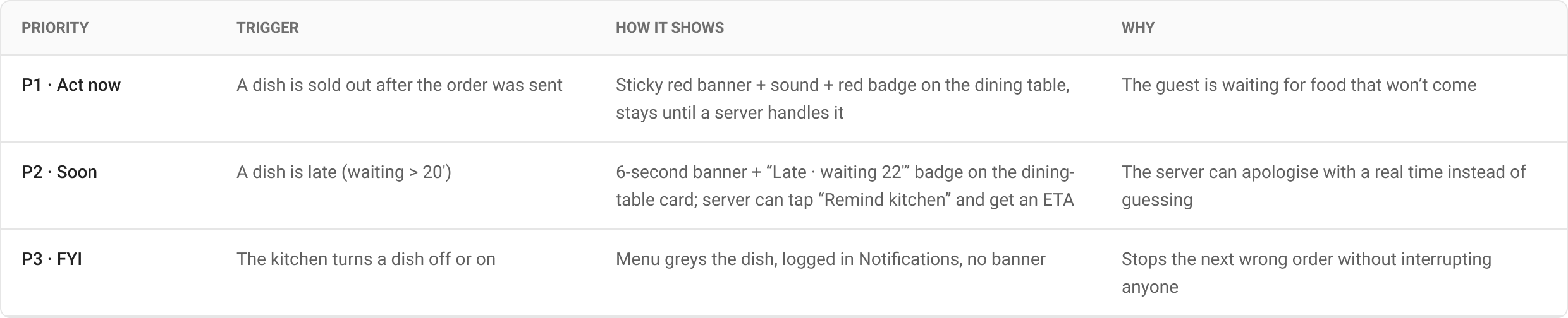
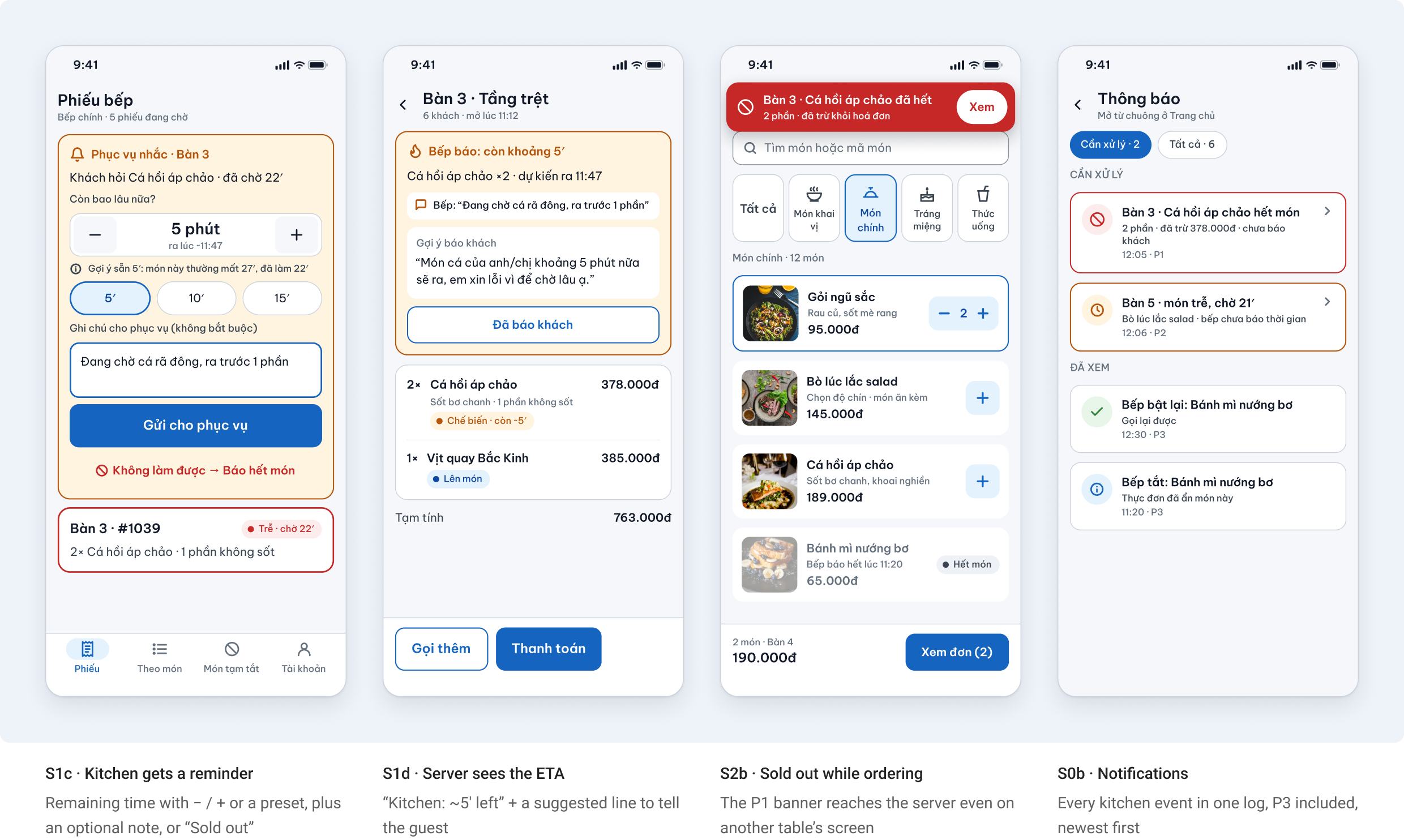
Notification priorities between kitchen and service
Not every kitchen event deserves a banner. I ranked them by what happens to the guest if the server doesn’t know.
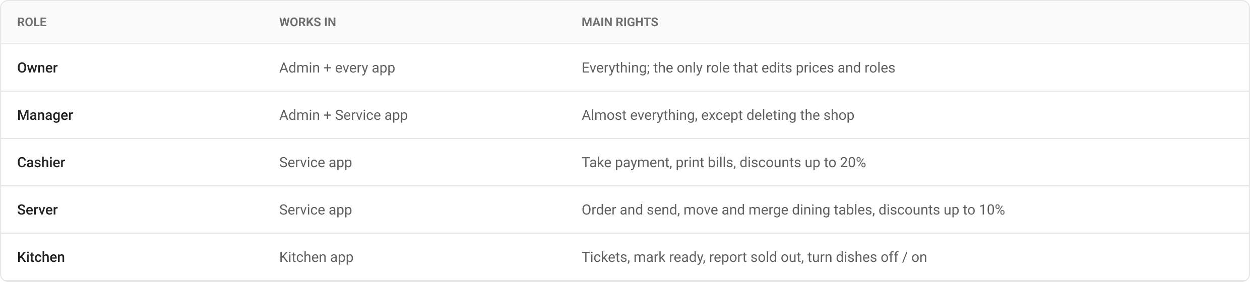
Roles and permissions
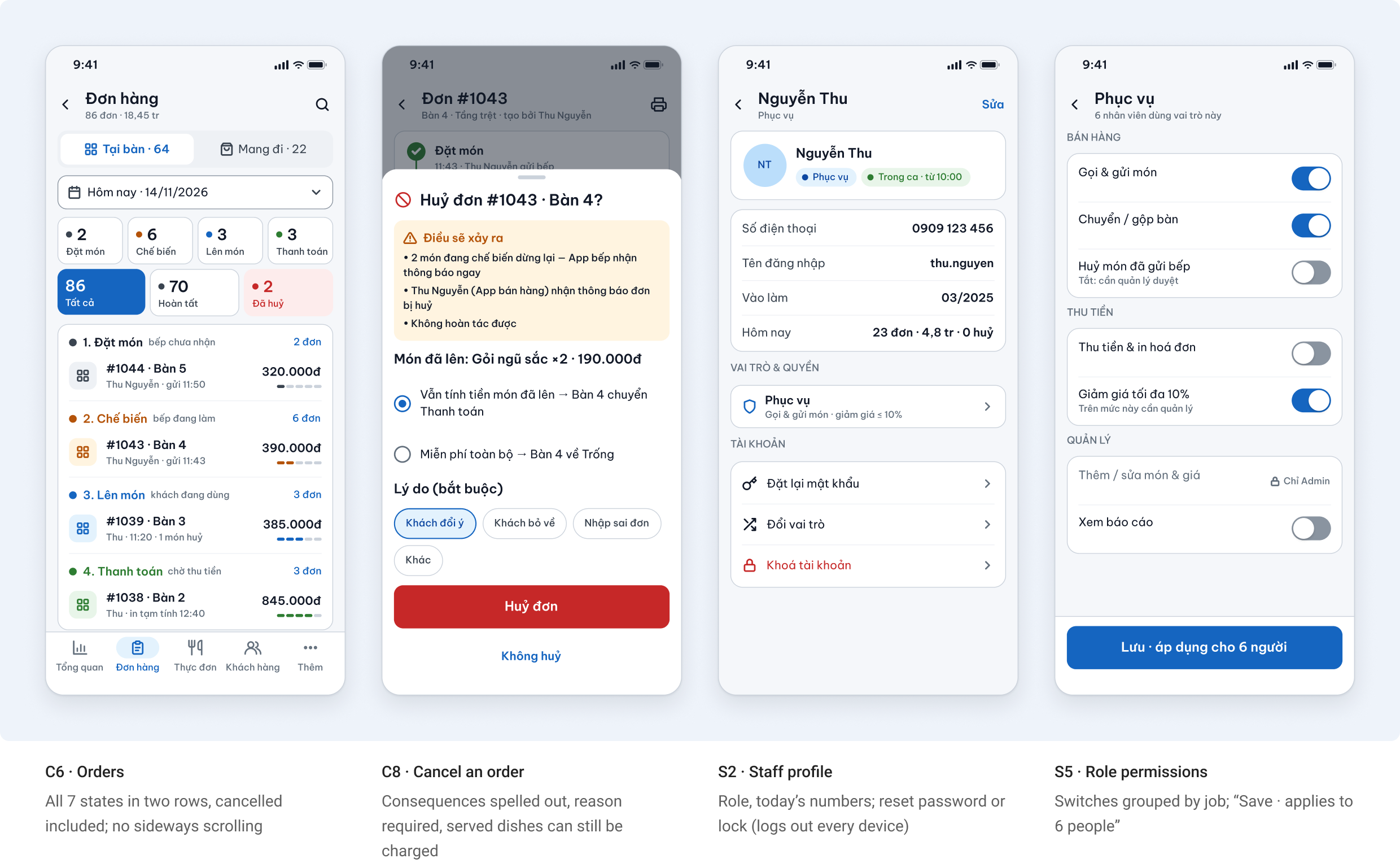
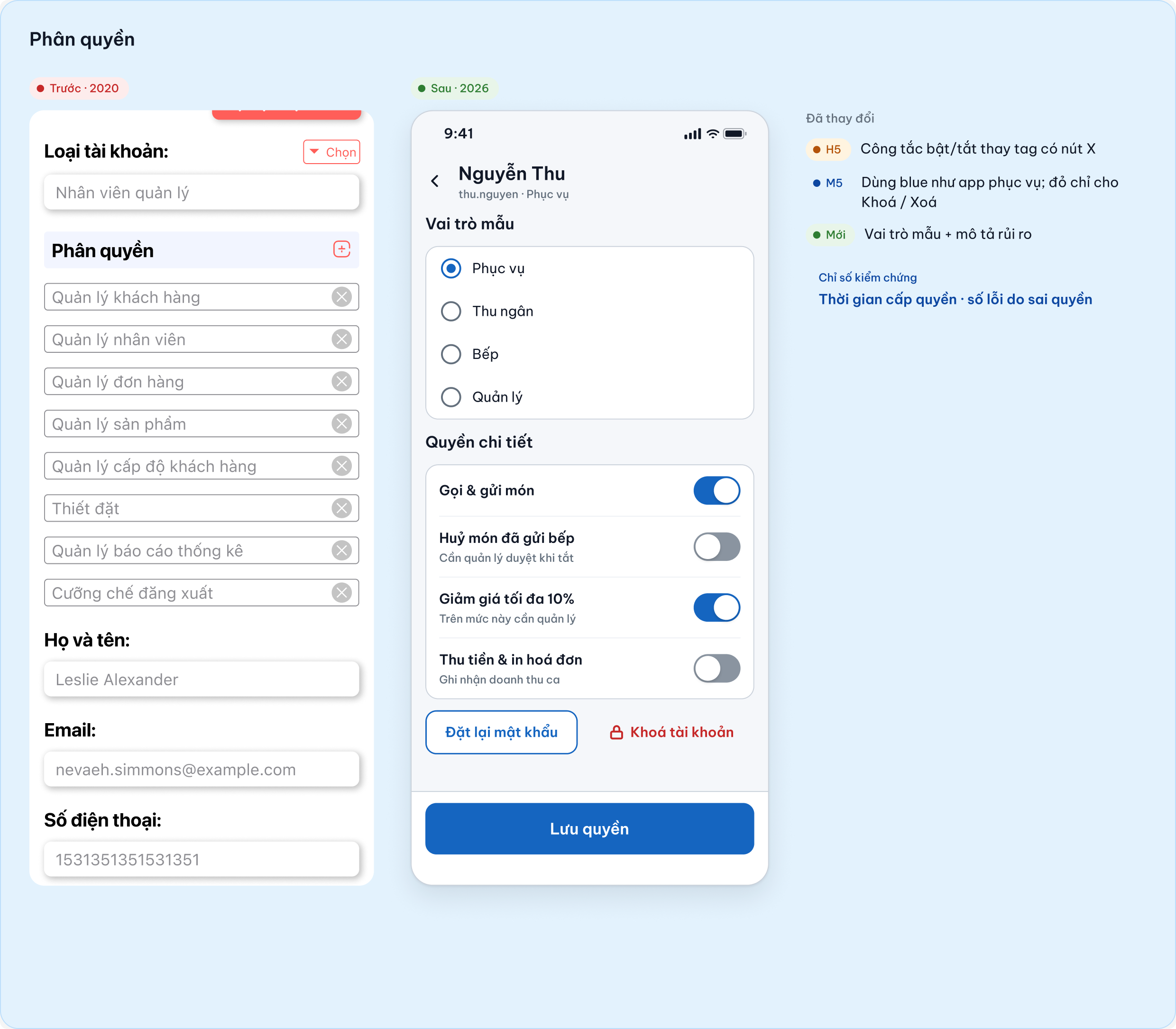
Account types and module permissions were two separate lists in the old admin. I merged them into roles with clear rights; staff inherit the role, so nobody toggles switches person by person.
The data-flow board in the working file
How “Send to kitchen” reaches the kitchen and how each dish status comes back to the server in real time, drawn with the real screens.
4. Service App (owner, server, cashier)
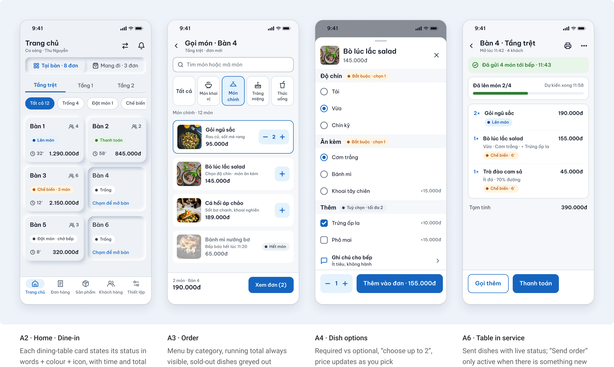
Built for one hand and a busy floor. The service app follows an order from the dining table to the payment, and each step answers a failure from the walkthrough in section 2. 19 screens in the working file; the key ones are below.
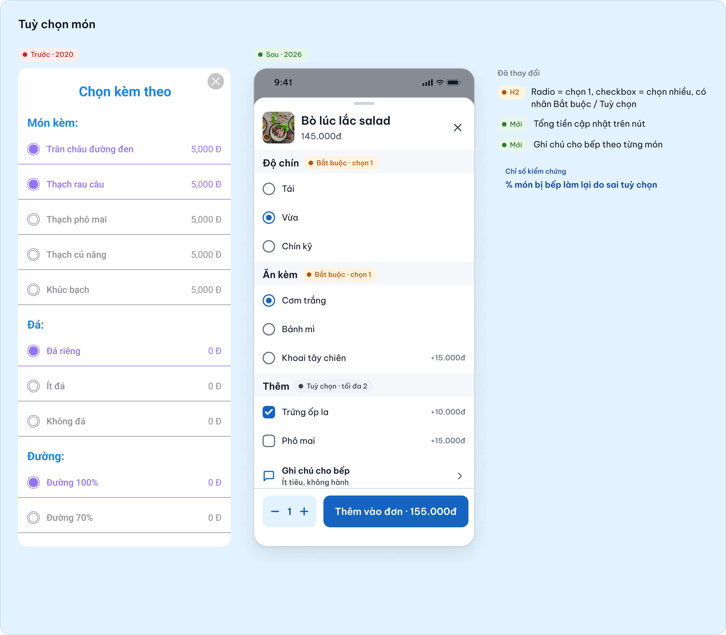
Order for a dining table
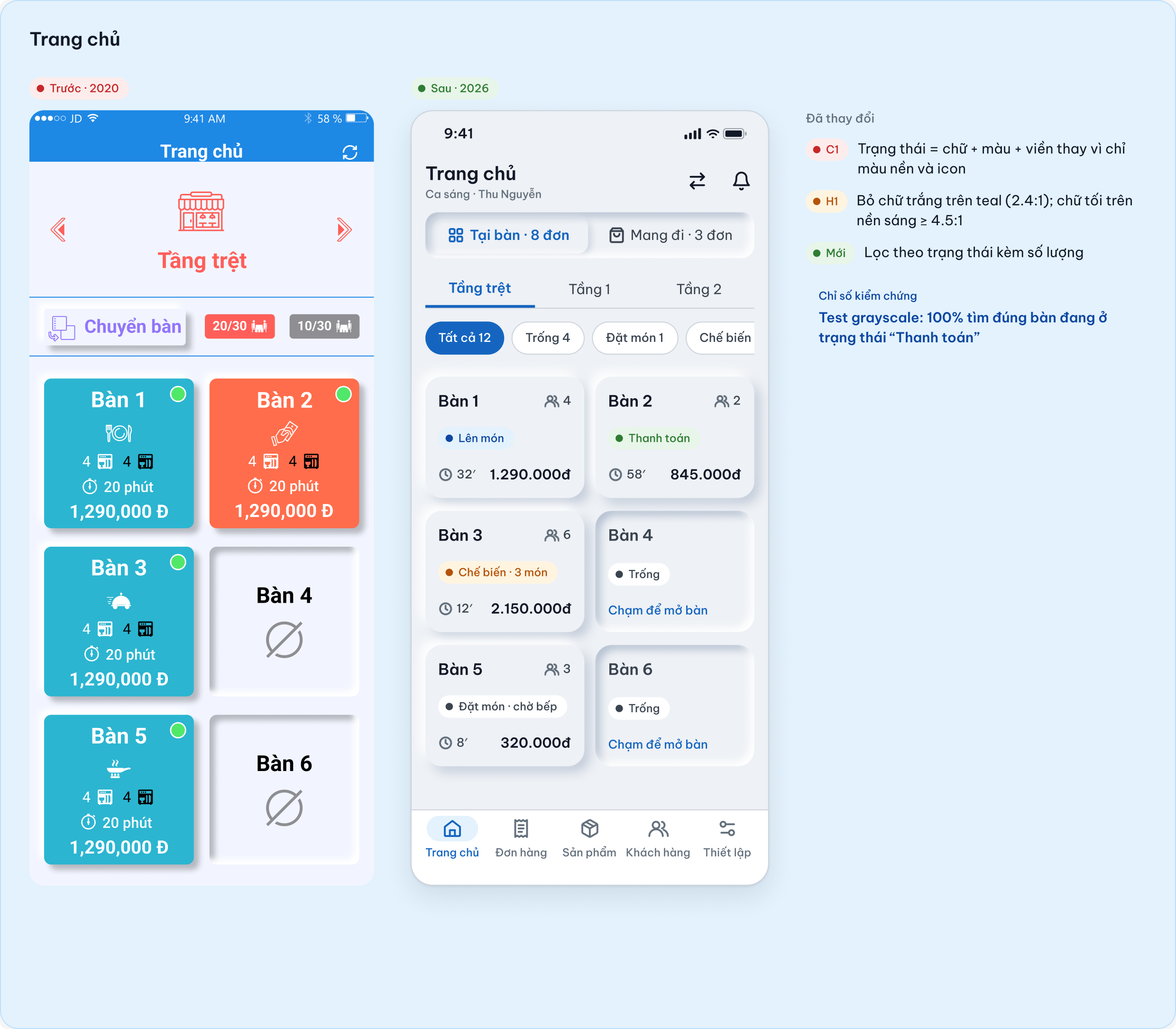
Home splits Dine-in and Takeaway. Takeaway orders use the same card as dining tables, so there is one pattern to learn.
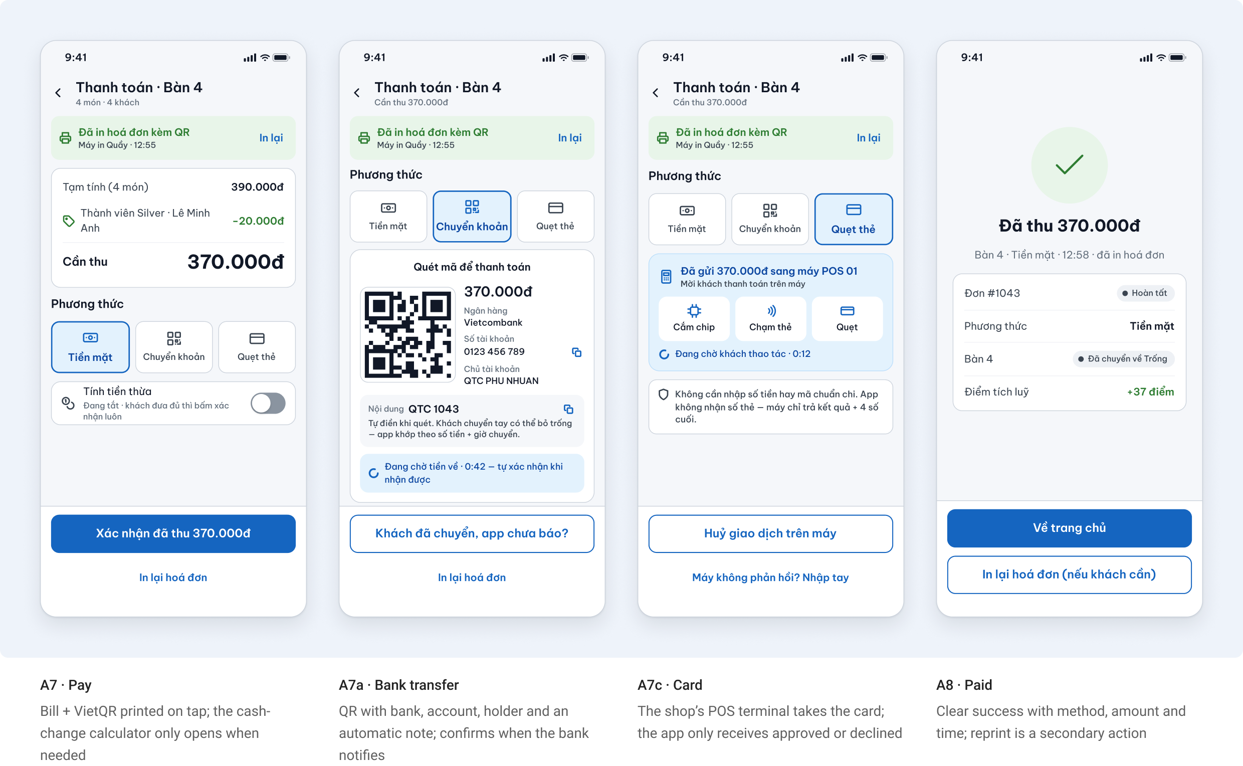
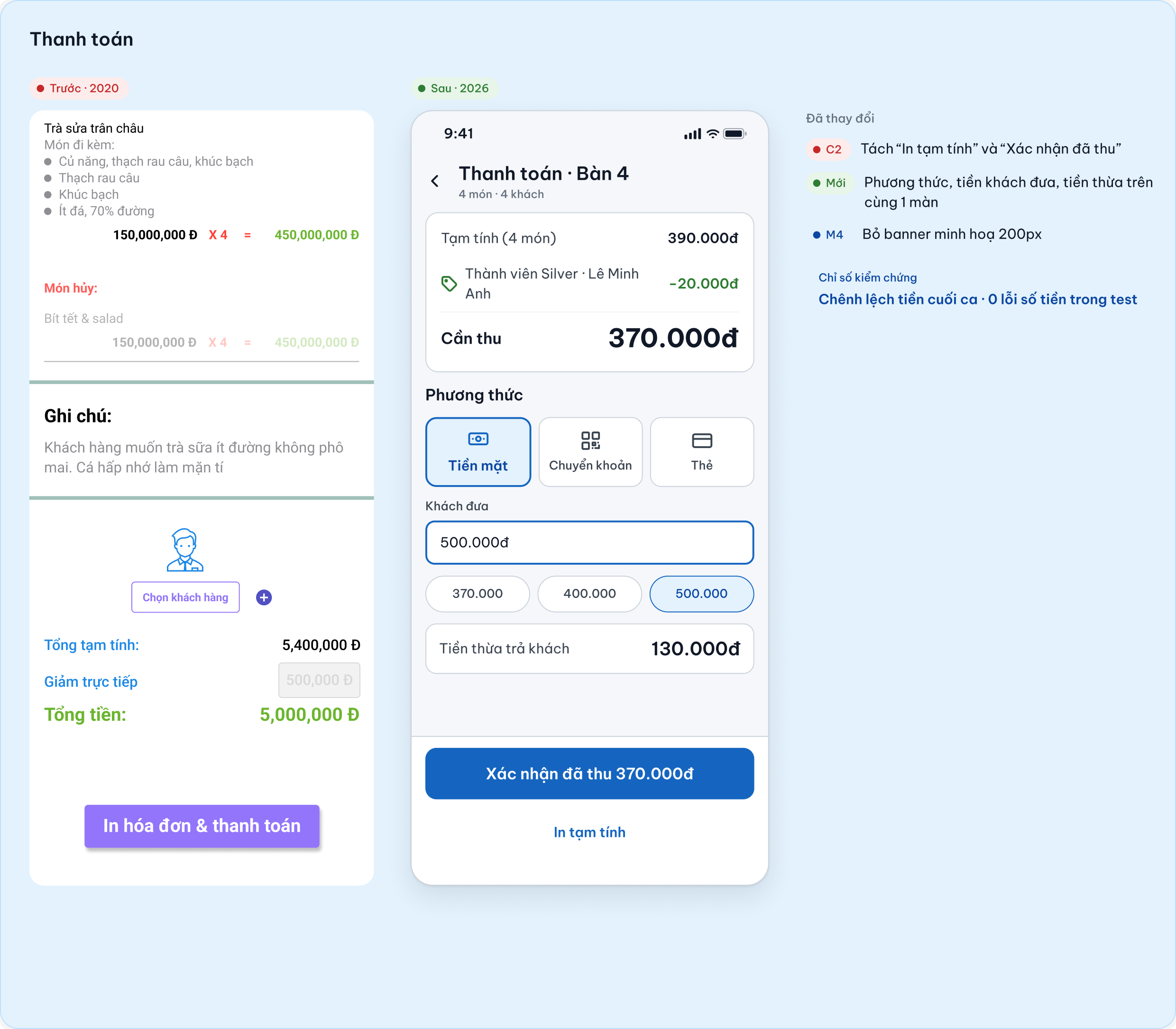
Get paid without mistakes
The old “Print bill & pay” button mixed two actions and never confirmed anything. Now tapping “Pay” always prints the bill with a VietQR code, then the cashier closes it with the method the guest actually used.
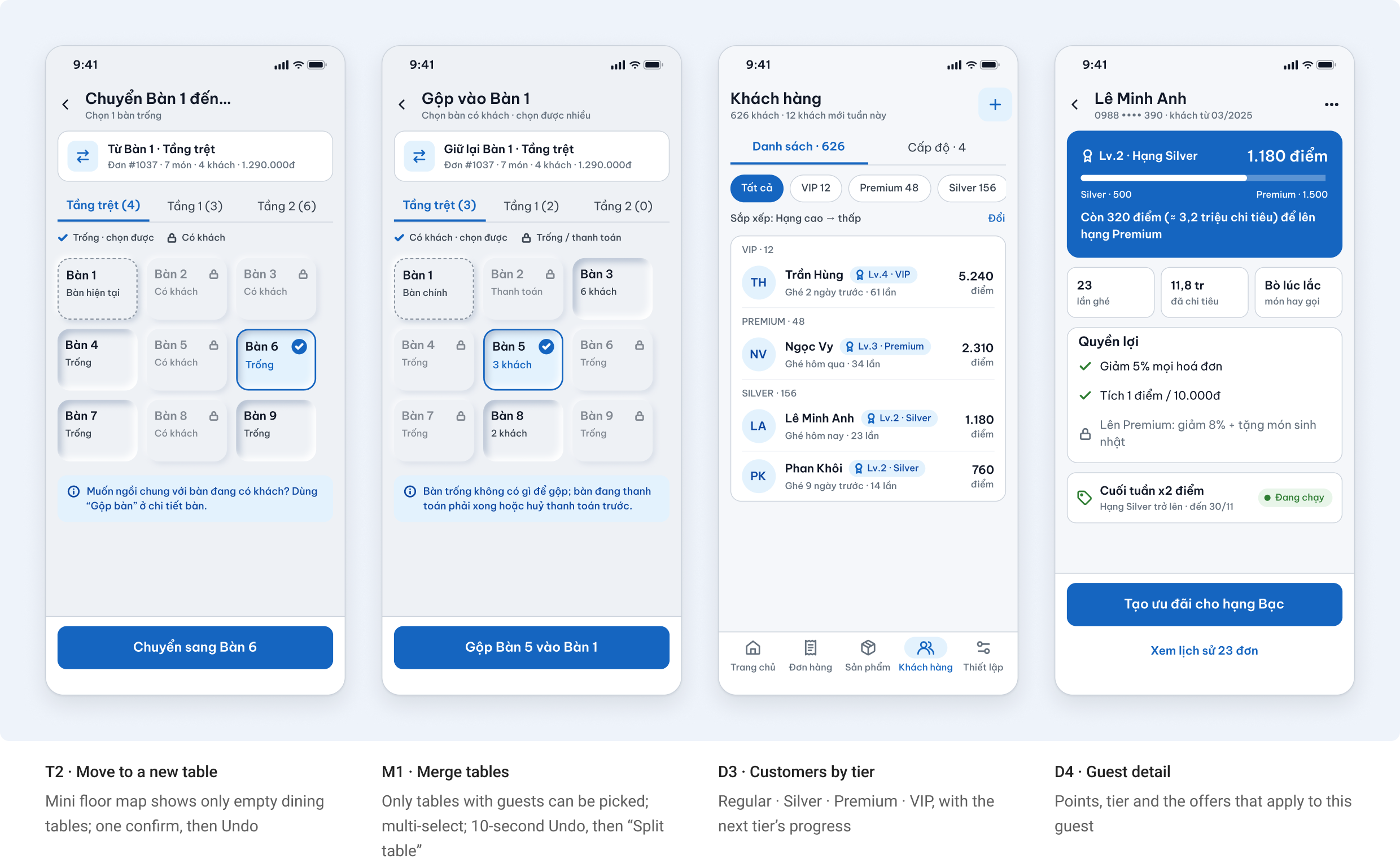
Move, merge and know your guests
Moving and merging dining tables start from the table itself, not from a separate menu. Customers are sorted by tier so the owner can run offers by level.
5. Kitchen App
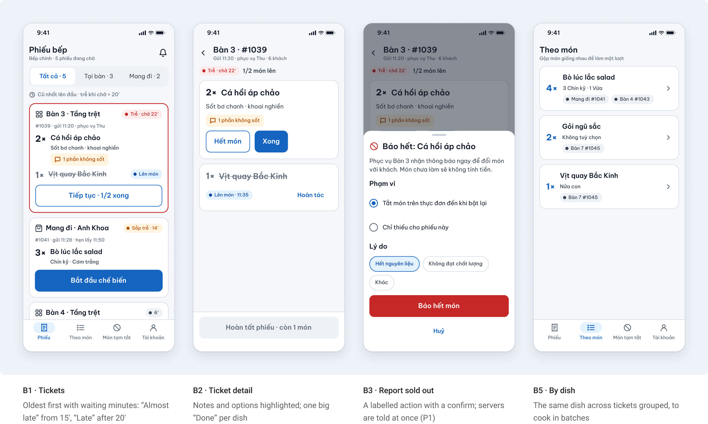
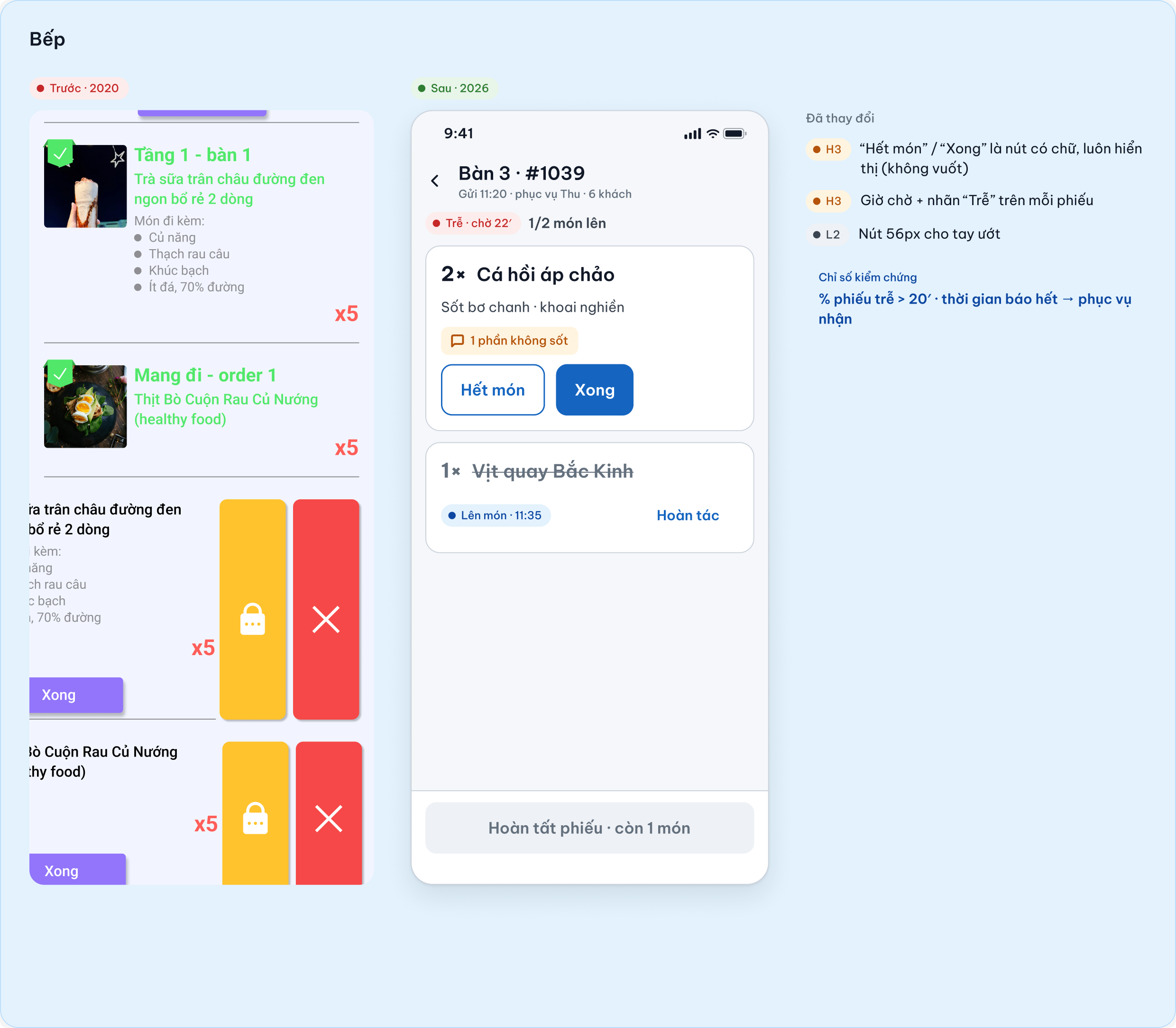
A wall-mounted device, read from a metre away by people with wet hands. Fewer and bigger targets, every action is a labelled button, and the waiting time is always on screen.
Tickets you can read from a metre away
Kitchen ↔ service: late and sold-out
The two moments that used to need shouting across the room now have a defined loop, so servers can answer the guest with real information.
6. Admin mobile · Owner and manager
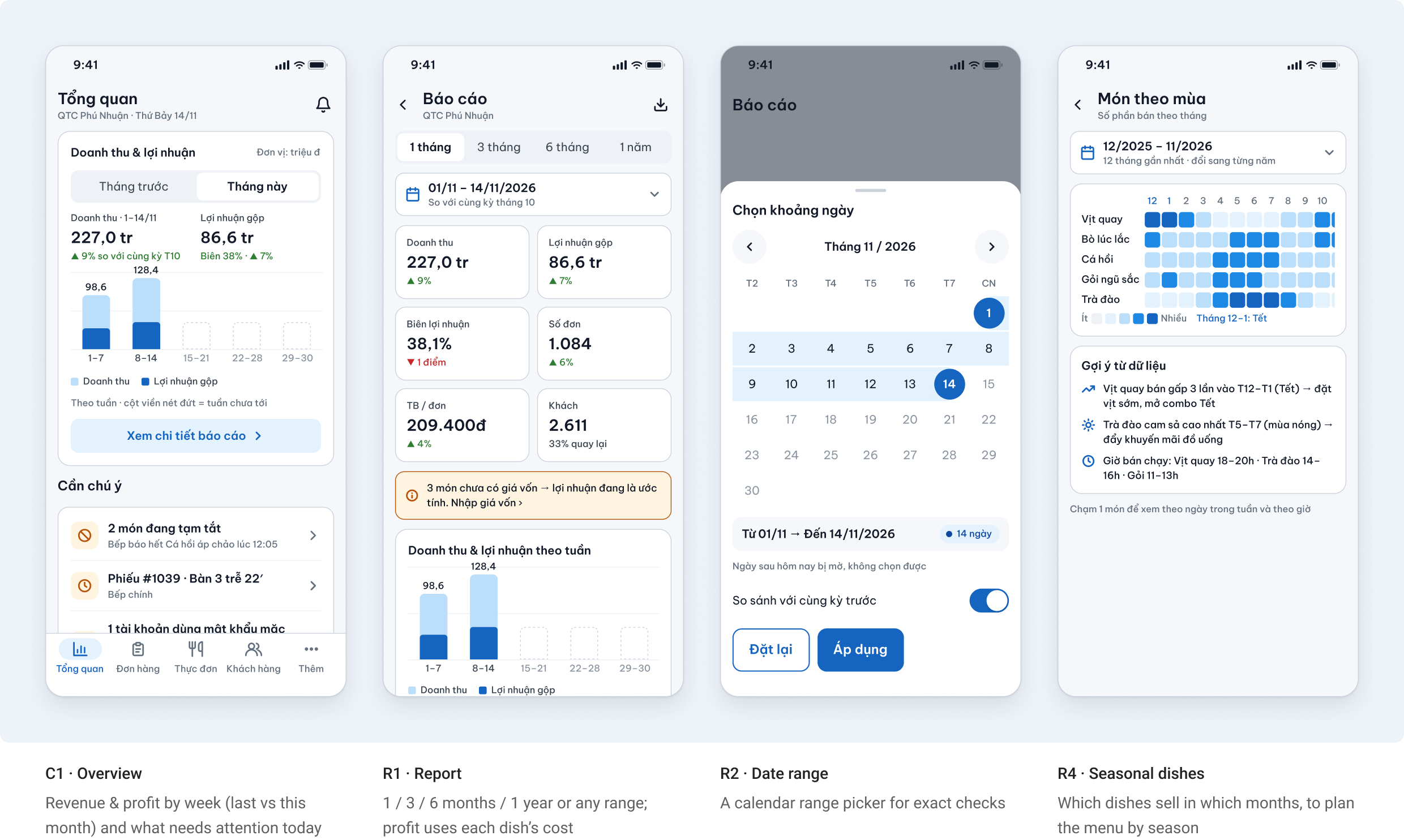
The old admin opened every module with an intro screen. Now the owner lands on the numbers, and five tabs cover the daily jobs: Overview · Orders · Menu · Customers · More. Settings and staff live under More as detail pages with a back button.
Know the day in 10 seconds
Revenue and profit sit on the home screen. Details are one tap away, with periods that match how an owner thinks: this month vs last month, then 1, 3, 6 months or a year.
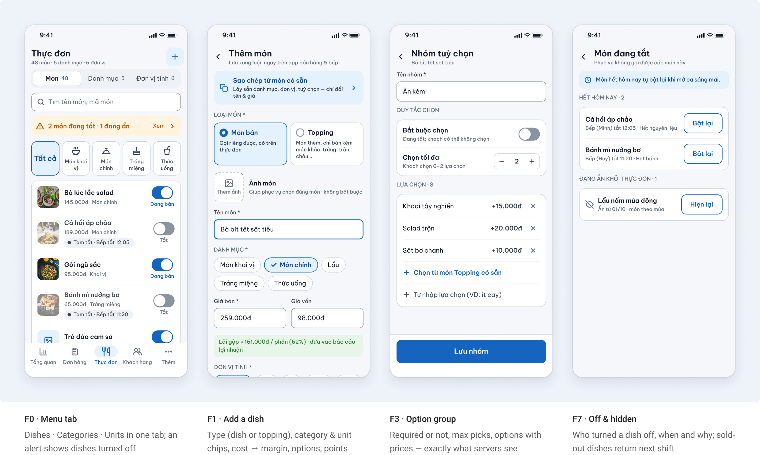
Run the whole menu from the phone
The old “Product management” was an intro screen in front of four separate lists (categories, products, units, sold-out). Now it is one tab with three segments, and one form for adding and editing a dish.
Orders, staff and permissions
Admin sees every order including cancelled ones, and staff rights follow roles instead of per-person switches.
7. Before → After
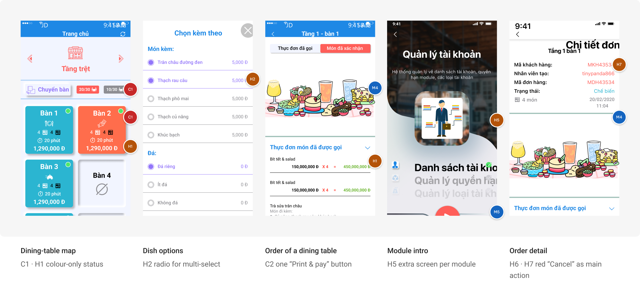
Five moments where the old UI failed most, side by side with the redesign. Each pair keeps the old screen unchanged and notes what changed and which audit issue it fixes.
Dining-table map
C1 · H1: status from colour only → text + colour + icon, readable in grayscale
Dish options
H2: radio for multi-select → required / optional, “up to 2”, live price
Payment
C2: one “Print & pay” button → print on Pay, choose the method, success screen
Kitchen
H3 · H4: swipe actions and no waiting time → labelled buttons, minutes on every ticket, sold-out alerts
Permissions
H5: tags with an X → roles with grouped switches and “Admin only” locks
The same walkthrough on the new screens
I repeated the cognitive walkthrough from section 2 on the redesigned screens: same task, same first-week server, same four questions. This is my own inspection, not a test with users.
Old UI: 9 of 16 checks passed. Redesign: 16 of 16 in my walkthrough. It still needs to be confirmed with real staff before shipping.
8. Edge Cases & System States
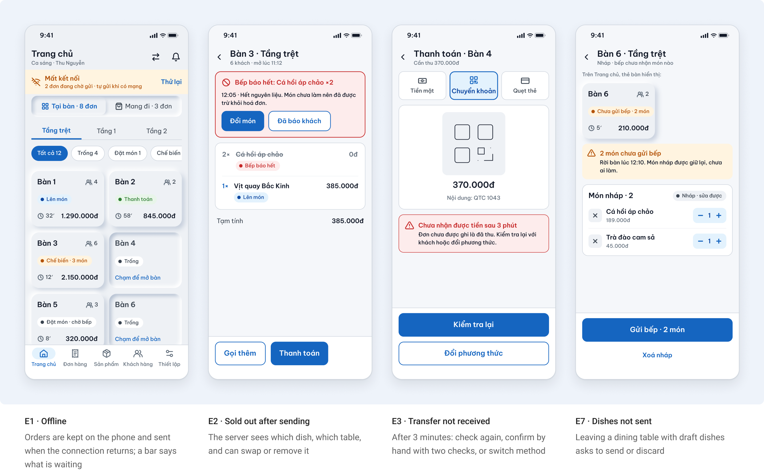
A POS is used on unstable Wi-Fi, at peak hours, by people who get interrupted. I designed the unhappy paths before polishing the happy one.
9. Lesson learned
1. How an F&B app actually flows
One order touches three roles. The service app opens and closes it, the kitchen moves its dishes, and the admin sets the rules (menu, prices, roles) and reads the results. Most of the old problems came from designing each app on its own. Mapping the flow across service, kitchen and admin first told me where every screen belongs and what it has to hand over to the next role.
2. Analyse the states before drawing screens
Writing down the order lifecycle (Ordered → Cooking → Served → Paying → Completed, plus Cancelled) and the dish states (Draft, Sold out) decided what each app shows, who can change what, and which events deserve a notification. Edge cases such as a dish sold out after sending, or a transfer that hasn’t arrived, came straight out of that state model.
3. Two inspection methods, two different lenses
Heuristic evaluation showed what was wrong on each screen; the cognitive walkthrough showed where a first-week server gets stuck across the whole task. Together they gave every change a reason I can trace back. They are inspections, not user tests, so watching real staff use it is the honest next step.